A HistData
We use HistData Package. See https://CRAN.R-project.org/package=HistData.
library(tidyverse)
#> ── Attaching core tidyverse packages ──── tidyverse 2.0.0 ──
#> ✔ dplyr     1.1.3     ✔ readr     2.1.4
#> ✔ forcats   1.0.0     ✔ stringr   1.5.0
#> ✔ ggplot2   3.4.4     ✔ tibble    3.2.1
#> ✔ lubridate 1.9.3     ✔ tidyr     1.3.0
#> ✔ purrr     1.0.2
#> ── Conflicts ────────────────────── tidyverse_conflicts() ──
#> ✖ dplyr::filter() masks stats::filter()
#> ✖ dplyr::lag()    masks stats::lag()
#> ℹ Use the conflicted package (<http://conflicted.r-lib.org/>) to force all conflicts to become errors
library(HistData)
A.1 HistData: Data Sets from the History of Statistics and Data Visualization
- URL: https://cran.r-project.org/web/packages/HistData/index.html
- Description: The ‘HistData’ package provides a collection of small data sets that are interesting and important in the history of statistics and data visualization. The goal of the package is to make these available, both for instructional use and for historical research. Some of these present interesting challenges for graphics or analysis in R.
- Reference Manual: HistData.pdf
- Vignettes: Duplicate and Missing Cases in Snow.deaths
- Reverse Depend: UsingR
A.2 Nightingale’s Data
Nightingale’s data is contained in HistData Package of R. See https://www.rdocumentation.org/packages/HistData/versions/0.8-6/topics/Nightingale
A.2.1 Basic References
- Florence Nightingale Museum in London: https://www.florence-nightingale.co.uk
- Florence Nightingale biography: https://www.florence-nightingale.co.uk/florence-nightingale-biography/
- Florence Nightingale biography: https://www.florence-nightingale.co.uk/florence-nightingale-biography/
- BBC: Florence Nightingale: Saving lives with statistics: https://www.bbc.co.uk/teach/florence-nightingale-saving-lives-with-statistics/zjksmfr
- Insights in Social History by Hugh Small: http://www.florence-nightingale-avenging-angel.co.uk
- Wikipedia: https://en.wikipedia.org/wiki/Florence_Nightingale
- Life expectancy (from birth) in the United Kingdom from 1765 to 2020: https://www.statista.com/statistics/1040159/life-expectancy-united-kingdom-all-time/
- Cure: Medical Treatment
- Care: Nursing
- Prevention: Public Health
A.2.2 Nightingale Datasets
- Details: For a given cause of death, D, annual rates per 1000 are calculated as 12 * 1000 * D / Army, rounded to 1 decimal.
The two panels of Nightingale’s Coxcomb correspond to dates before and after March 1855
- Format: A data frame with 24 observations on the following 10 variables.
- Date: a Date, composed as as.Date(paste(Year, Month, 1, sep=‘-’), “%Y-%b-%d”)
- Month: Month of the Crimean War, an ordered factor
- Year: Year of the Crimean War
- Army: Estimated average monthly strength of the British army
- Disease: Number of deaths from preventable or mitagable zymotic diseases
- Wounds: Number of deaths directly from battle wounds
- Other: Number of deaths from other causes
- Disease.rate: Annual rate of deaths from preventable or mitagable zymotic diseases, per 1000
- Wounds.rate: Annual rate of deaths directly from battle wounds, per 1000
- Other.rate: Annual rate of deaths from other causes, per 1000
A.2.3 References
- Nightingale, F. (1858) Notes on Matters Affecting the Health, Efficiency, and Hospital Administration of the British Army Harrison and Sons, 1858
- Nightingale, F. (1859) A Contribution to the Sanitary History of the British Army during the Late War with Russia London: John W. Parker and Son.
- Small, H. (1998) Florence Nightingale’s statistical diagrams http://www.florence-nightingale-avenging-angel.co.uk/GraphicsPaper/Graphics.htm
- Pearson, M. and Short, I. (2008) Nightingale’s Rose (flash animation). http://understandinguncertainty.org/files/animations/Nightingale11/Nightingale1.html
A.2.4 Reading Nightingale Data and Glimpse the Structure
library(HistData)
library(tidyverse)
data(Nightingale)
Nightingale
#>          Date Month Year  Army Disease Wounds Other
#> 1  1854-04-01   Apr 1854  8571       1      0     5
#> 2  1854-05-01   May 1854 23333      12      0     9
#> 3  1854-06-01   Jun 1854 28333      11      0     6
#> 4  1854-07-01   Jul 1854 28722     359      0    23
#> 5  1854-08-01   Aug 1854 30246     828      1    30
#> 6  1854-09-01   Sep 1854 30290     788     81    70
#> 7  1854-10-01   Oct 1854 30643     503    132   128
#> 8  1854-11-01   Nov 1854 29736     844    287   106
#> 9  1854-12-01   Dec 1854 32779    1725    114   131
#> 10 1855-01-01   Jan 1855 32393    2761     83   324
#> 11 1855-02-01   Feb 1855 30919    2120     42   361
#> 12 1855-03-01   Mar 1855 30107    1205     32   172
#> 13 1855-04-01   Apr 1855 32252     477     48    57
#> 14 1855-05-01   May 1855 35473     508     49    37
#> 15 1855-06-01   Jun 1855 38863     802    209    31
#> 16 1855-07-01   Jul 1855 42647     382    134    33
#> 17 1855-08-01   Aug 1855 44614     483    164    25
#> 18 1855-09-01   Sep 1855 47751     189    276    20
#> 19 1855-10-01   Oct 1855 46852     128     53    18
#> 20 1855-11-01   Nov 1855 37853     178     33    32
#> 21 1855-12-01   Dec 1855 43217      91     18    28
#> 22 1856-01-01   Jan 1856 44212      42      2    48
#> 23 1856-02-01   Feb 1856 43485      24      0    19
#> 24 1856-03-01   Mar 1856 46140      15      0    35
#>    Disease.rate Wounds.rate Other.rate
#> 1           1.4         0.0        7.0
#> 2           6.2         0.0        4.6
#> 3           4.7         0.0        2.5
#> 4         150.0         0.0        9.6
#> 5         328.5         0.4       11.9
#> 6         312.2        32.1       27.7
#> 7         197.0        51.7       50.1
#> 8         340.6       115.8       42.8
#> 9         631.5        41.7       48.0
#> 10       1022.8        30.7      120.0
#> 11        822.8        16.3      140.1
#> 12        480.3        12.8       68.6
#> 13        177.5        17.9       21.2
#> 14        171.8        16.6       12.5
#> 15        247.6        64.5        9.6
#> 16        107.5        37.7        9.3
#> 17        129.9        44.1        6.7
#> 18         47.5        69.4        5.0
#> 19         32.8        13.6        4.6
#> 20         56.4        10.5       10.1
#> 21         25.3         5.0        7.8
#> 22         11.4         0.5       13.0
#> 23          6.6         0.0        5.2
#> 24          3.9         0.0        9.1
glimpse(Nightingale)
#> Rows: 24
#> Columns: 10
#> $ Date         <date> 1854-04-01, 1854-05-01, 1854-06-01, …
#> $ Month        <ord> Apr, May, Jun, Jul, Aug, Sep, Oct, No…
#> $ Year         <int> 1854, 1854, 1854, 1854, 1854, 1854, 1…
#> $ Army         <int> 8571, 23333, 28333, 28722, 30246, 302…
#> $ Disease      <int> 1, 12, 11, 359, 828, 788, 503, 844, 1…
#> $ Wounds       <int> 0, 0, 0, 0, 1, 81, 132, 287, 114, 83,…
#> $ Other        <int> 5, 9, 6, 23, 30, 70, 128, 106, 131, 3…
#> $ Disease.rate <dbl> 1.4, 6.2, 4.7, 150.0, 328.5, 312.2, 1…
#> $ Wounds.rate  <dbl> 0.0, 0.0, 0.0, 0.0, 0.4, 32.1, 51.7, …
#> $ Other.rate   <dbl> 7.0, 4.6, 2.5, 9.6, 11.9, 27.7, 50.1,…
A.2.5 Comparison of Death Causes
df_cause <- Nightingale %>%
  select(Disease, Wounds, Other) %>%
  pivot_longer(cols = everything(), names_to = "Cause", values_to = "Death")

df_cause %>% ggplot(aes(x = Cause, y = Death)) +
  geom_bar(stat = "identity")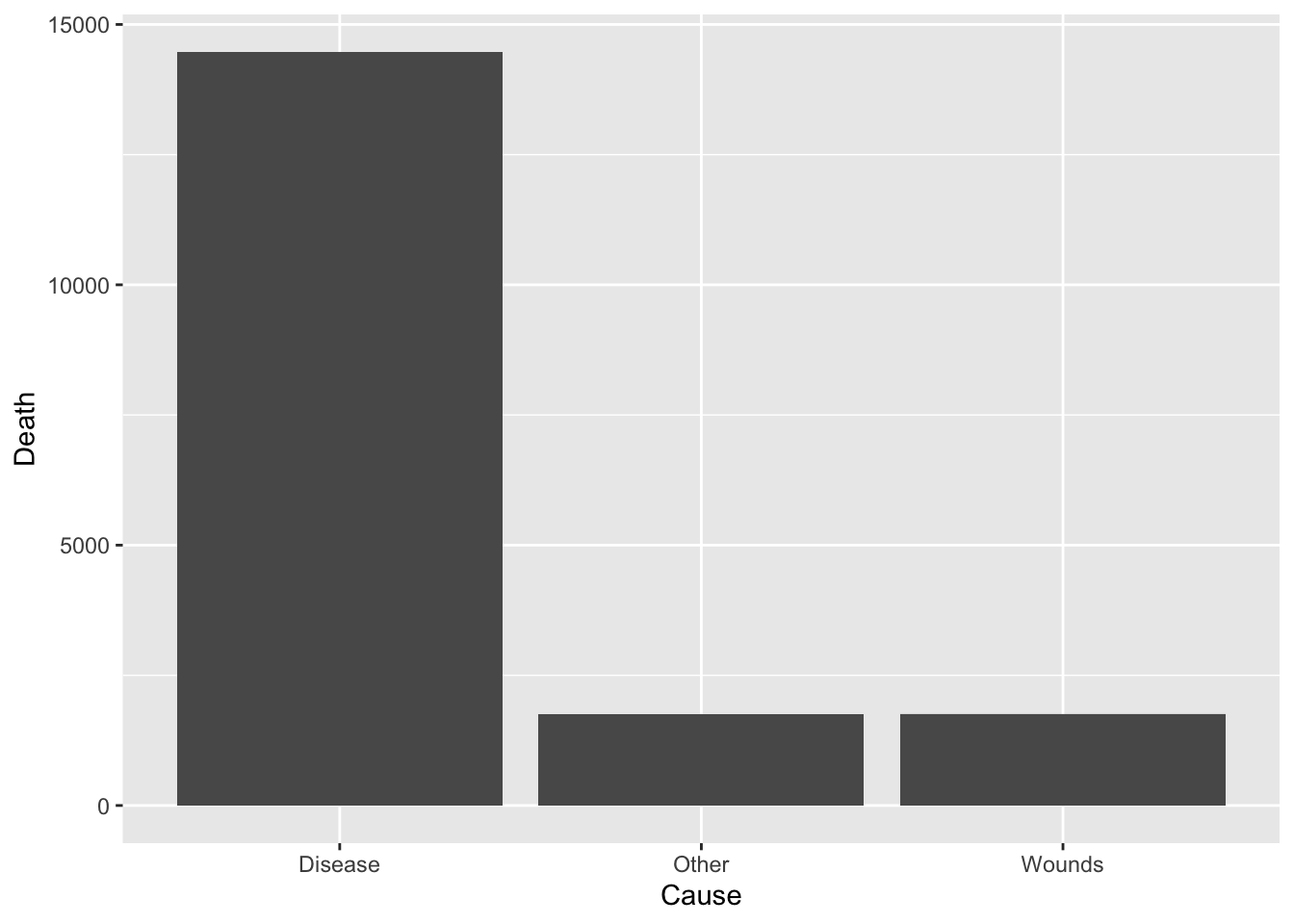
df_cause %>% ggplot(aes(x = "", y = Death, fill = Cause)) +
  geom_bar(width = 1, stat = "identity") +
  coord_polar("y", start=0)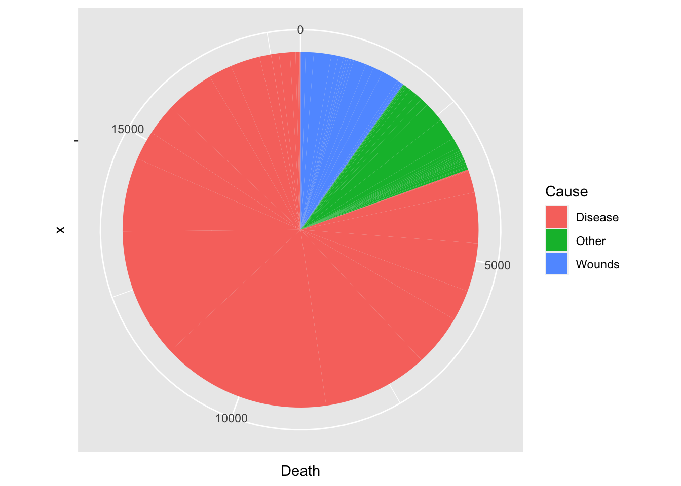
total = sum(df_cause$Death)
df_cause %>%
  group_by(Cause) %>%
  summarize(Rate = round(sum(Death)/total*100, digits = 1))
#> # A tibble: 3 × 2
#>   Cause    Rate
#>   <chr>   <dbl>
#> 1 Disease  80.5
#> 2 Other     9.7
#> 3 Wounds    9.8
df_rate <- Nightingale %>%
  select(Date, Army, Disease, Wounds, Other) %>%
  mutate(Death_Rate = (Disease + Wounds + Other)/Army,
         Disease_Rate = Disease/Army)

df_rate %>% ggplot(aes(x = Date)) +
  geom_line(aes(y = Death_Rate)) +
  geom_line(aes(y = Disease_Rate), color = "blue") +
  geom_vline(xintercept = as.Date("1855-04-01"), color = "red")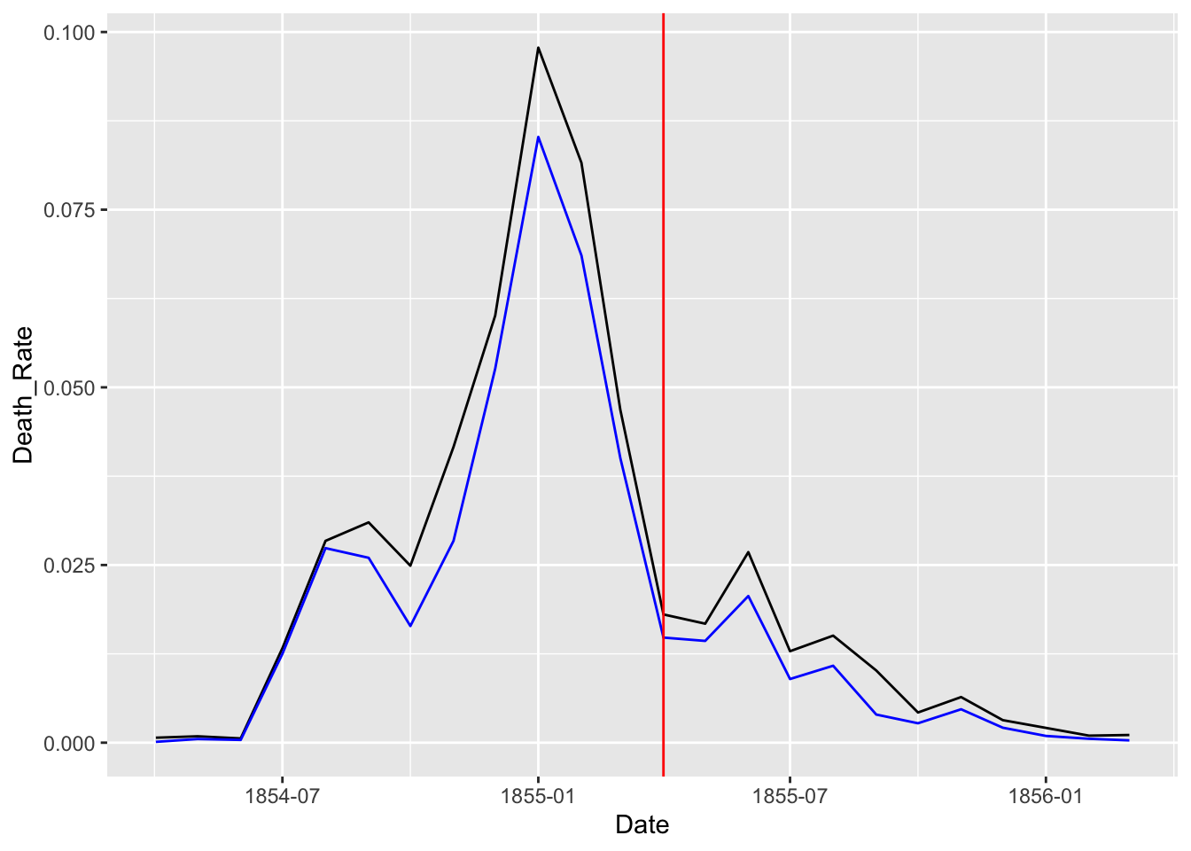
A.2.6 Data Wrangling - Tidying Data
- First, focus on the rates by cause
- Month, Year columns are redundant and use Date
- When rates are considered, Army, Disease, Wounds and Other columns are unnecessary.
- We use a long table to apply
ggplot2to visualise data.
dat %>% pivot_longer(cols = "columns kept as a vector", names_to = "variable", values_to = "date")
df_fn <- Nightingale %>%
  select(Date, "Disease_Rate" = Disease.rate, "Wounds_Rate" = Wounds.rate, "Other_Rate" = Other.rate) %>%
  pivot_longer(cols = Disease_Rate:Other_Rate, names_to = "Cause", values_to = "Deaths")
df_fn
#> # A tibble: 72 × 3
#>    Date       Cause        Deaths
#>    <date>     <chr>         <dbl>
#>  1 1854-04-01 Disease_Rate    1.4
#>  2 1854-04-01 Wounds_Rate     0
#>  3 1854-04-01 Other_Rate      7
#>  4 1854-05-01 Disease_Rate    6.2
#>  5 1854-05-01 Wounds_Rate     0
#>  6 1854-05-01 Other_Rate      4.6
#>  7 1854-06-01 Disease_Rate    4.7
#>  8 1854-06-01 Wounds_Rate     0
#>  9 1854-06-01 Other_Rate      2.5
#> 10 1854-07-01 Disease_Rate  150
#> # ℹ 62 more rows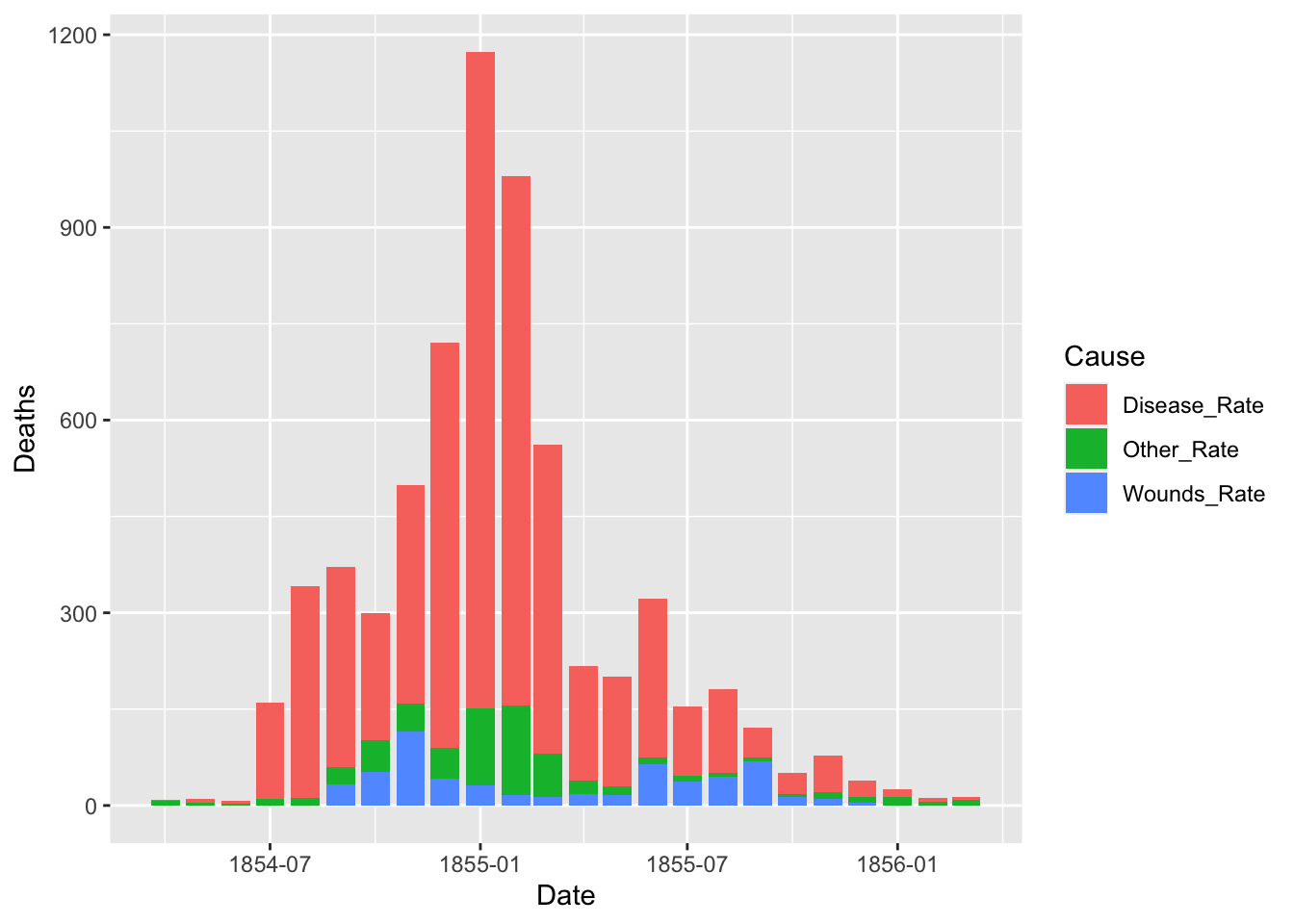
The default of the position is “stack”. The other options are “dodge” and “identity”. The option “identity” is not helpful for bars, because it overlaps them. See that overlapping by setting a small value for alpha, transparency.
ggplot(df_fn) +
  geom_bar(aes(x = Date, y = Deaths, fill = Cause), stat = "identity", position = "dodge")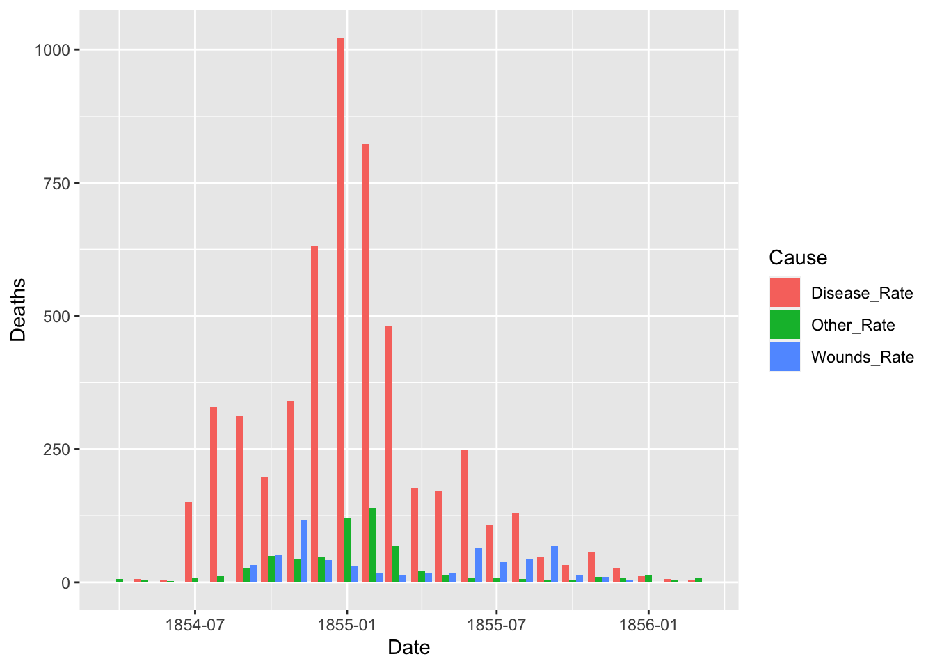
df_fn %>% filter(Date >= as.Date("1855-08-01")) %>%
  ggplot() +
  geom_bar(aes(x = Date, y = Deaths, fill = Cause), stat = "identity", position = "identity", alpha = 0.4)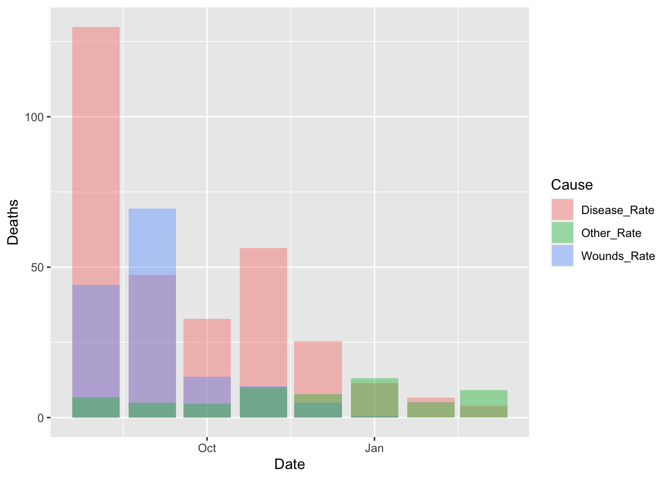
df_fn %>% filter(Date >= as.Date("1855-08-01")) %>%
  ggplot() +
  geom_bar(aes(x = Date, y = Deaths, fill = Cause), stat = "identity", position = "dodge")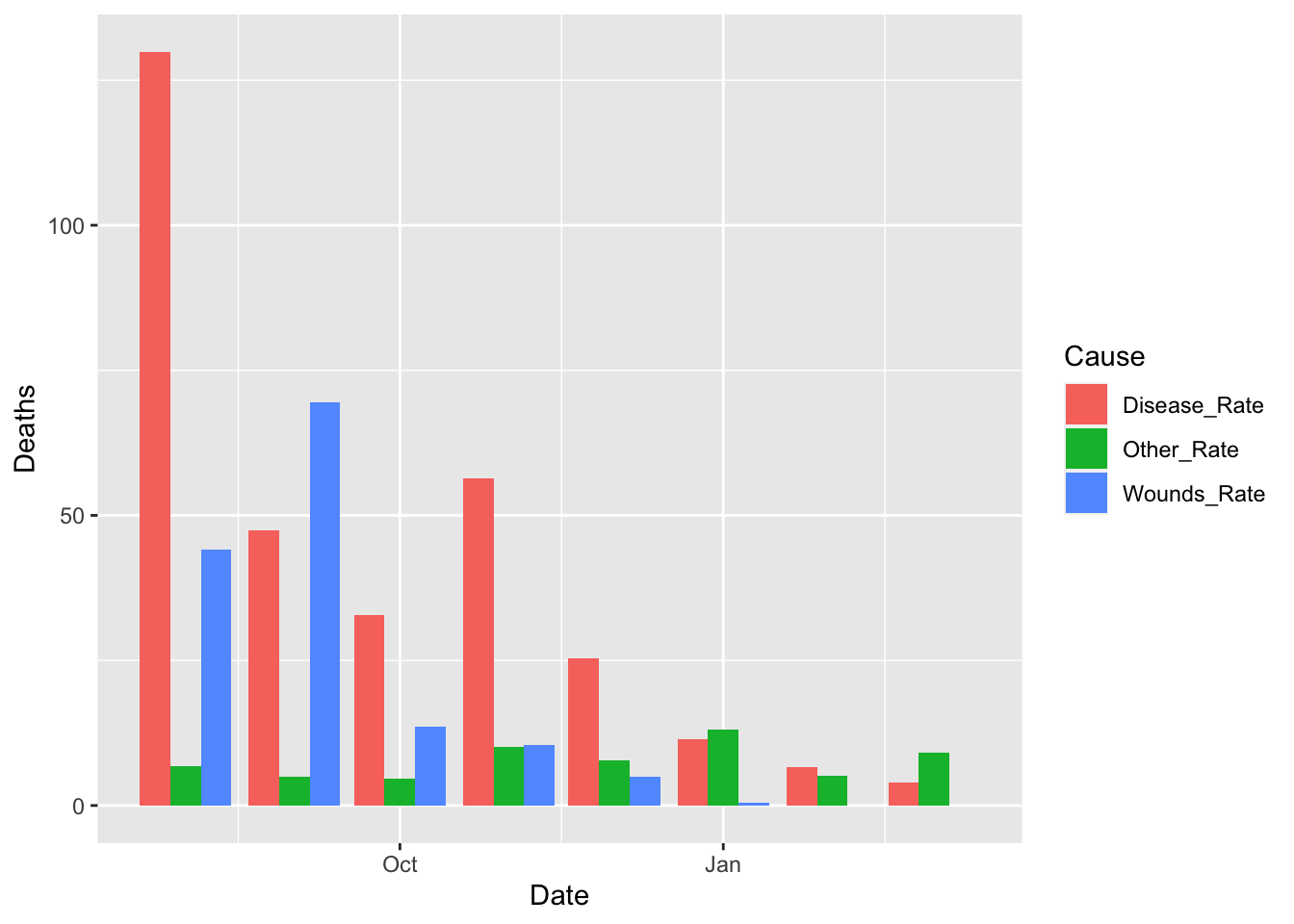
Let us split the data into two and see the change before and after the Sanitary Commission arrived in the middle of the war, i.e., March 6, 1885.
df_fn_ba <- df_fn %>%
  mutate(Regime = if_else(Date < as.Date("1855-04-01"), "Before", "After"))
df_fn_ba %>% filter(Date > as.Date("1855-01-01") & Date < as.Date("1855-06-01"))
#> # A tibble: 12 × 4
#>    Date       Cause        Deaths Regime
#>    <date>     <chr>         <dbl> <chr>
#>  1 1855-02-01 Disease_Rate  823.  Before
#>  2 1855-02-01 Wounds_Rate    16.3 Before
#>  3 1855-02-01 Other_Rate    140.  Before
#>  4 1855-03-01 Disease_Rate  480.  Before
#>  5 1855-03-01 Wounds_Rate    12.8 Before
#>  6 1855-03-01 Other_Rate     68.6 Before
#>  7 1855-04-01 Disease_Rate  178.  After
#>  8 1855-04-01 Wounds_Rate    17.9 After
#>  9 1855-04-01 Other_Rate     21.2 After
#> 10 1855-05-01 Disease_Rate  172.  After
#> 11 1855-05-01 Wounds_Rate    16.6 After
#> 12 1855-05-01 Other_Rate     12.5 After
df_fn_ba %>% filter(Regime == "Before") %>%
  ggplot() +
  geom_bar(aes(x = as.factor(Date), y=Deaths, fill = Cause),
           width = 1, position="identity", stat="identity", alpha = 0.5) +
  scale_y_sqrt() +
  coord_polar(start = 3*pi/2) +
  labs(title = "Causes of Mortality in the Army in the East")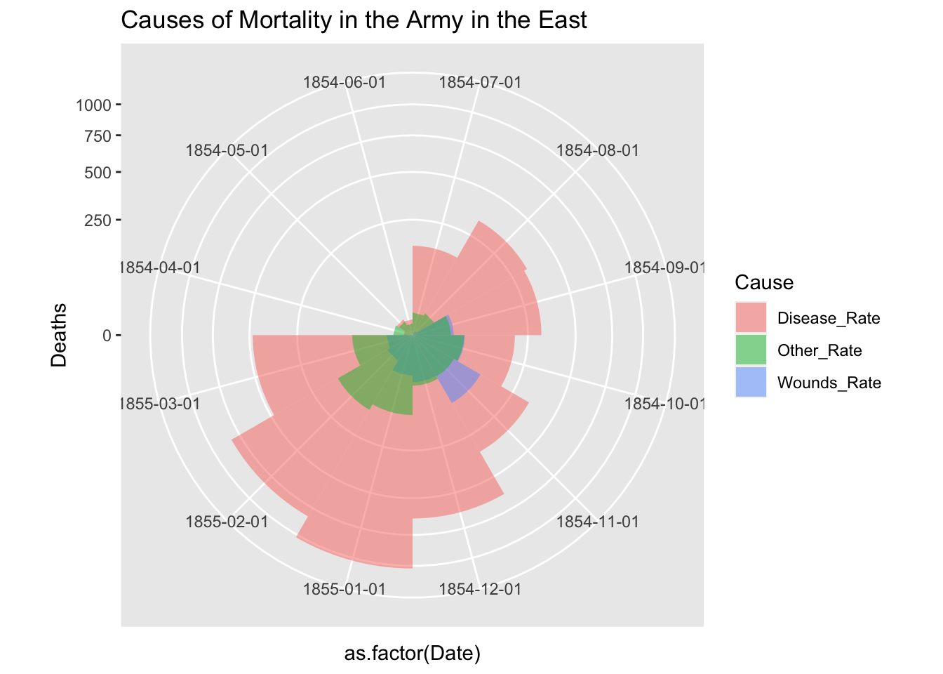
df_fn_ba %>% filter(Regime == "After") %>%
  ggplot() +
  geom_bar(aes(x = as.factor(Date), y=Deaths, fill = Cause),
           width = 1, position="identity", stat="identity", alpha = 0.5) +
  scale_y_sqrt() +
  coord_polar(start = 3*pi/2) +
  labs(title = "Causes of Mortality in the Army in the East")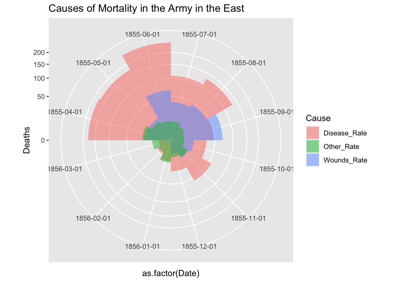
Please refer to the following code, if you want to use facet_gid. The argument scales = “free” of facet_grid does not support coord_polar. However, if you add the first two lines, it seems to work. See https://github.com/tidyverse/ggplot2/issues/2815.
cp <- coord_polar(theta = "x", start = 3*pi/2)
cp$is_free <- function() TRUE

df_fn_ba %>% #filter(Regime == "Before") %>%
  ggplot() +
  geom_bar(aes(x = as.factor(Date), y=Deaths, fill = Cause),
           width = 1, position="identity", stat="identity", alpha = 0.5) +
  scale_y_sqrt() + # death scale is proportional to the area
  cp +
  facet_grid(. ~ Regime, labeller = label_both, scales = "free") +
  labs(title = "Causes of Mortality in the Army in the East") +
  theme(aspect.ratio = 1)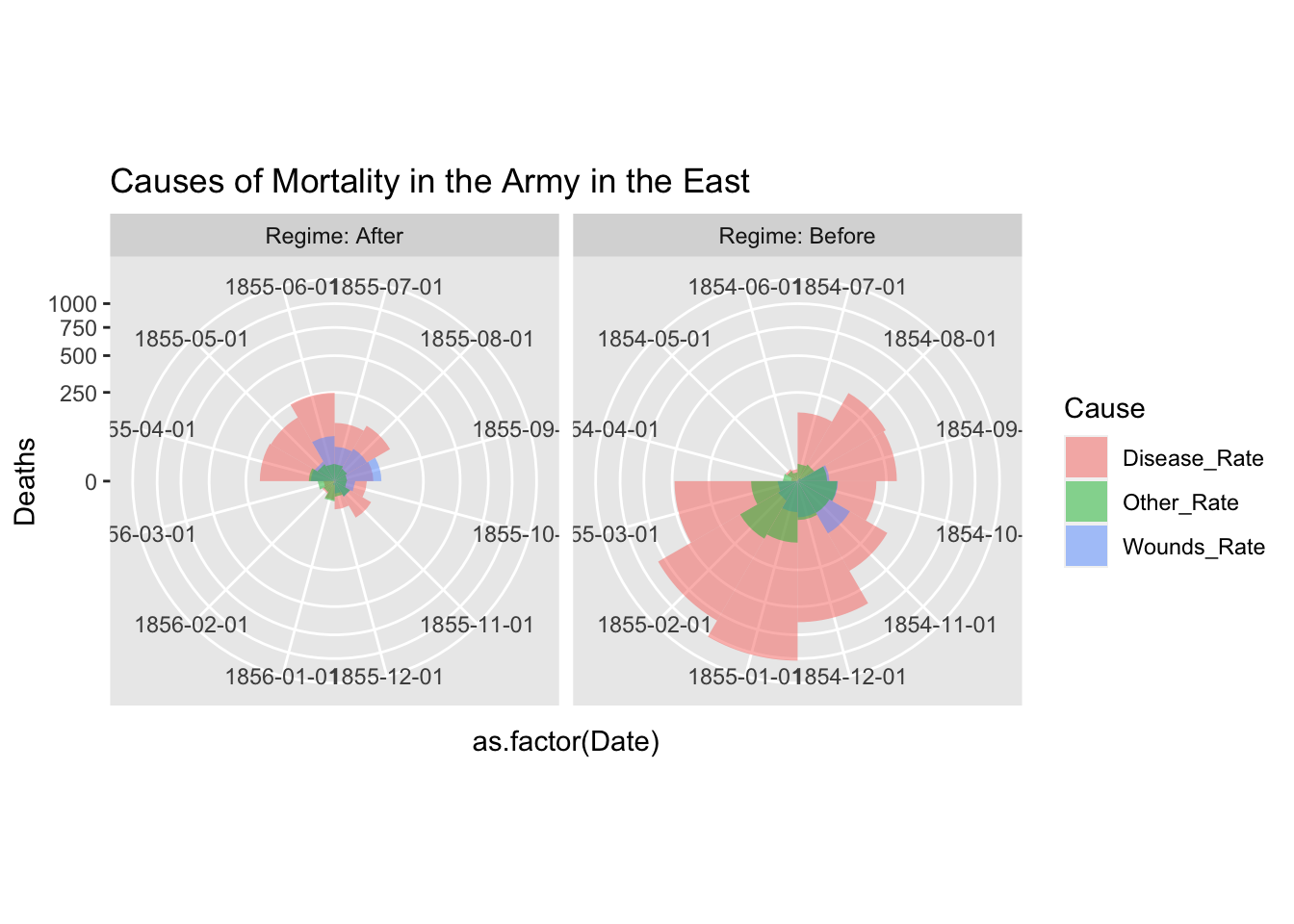
df_fn_before <- df_fn %>% filter(Date < as.Date("1855-04-01"))
nrow(df_fn_before)
#> [1] 36
df_fn_after <- df_fn %>% filter(Date >= as.Date("1855-04-01"))
nrow(df_fn_after)
#> [1] 36
ggplot(df_fn_before) +
  geom_bar(aes(x = Date, y = Deaths, fill = Cause), stat = "identity", position = "dodge")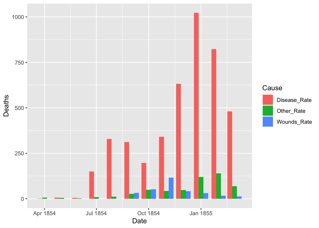
ggplot(df_fn_after) +
  geom_bar(aes(x = Date, y = Deaths, fill = Cause), stat = "identity", position = "dodge")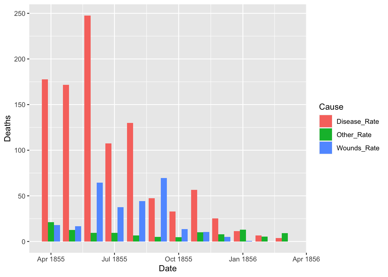
A.3 Galton’s Example
Galton’s data on the heights of parents and their children, by child
- Description: This data set lists the individual observations for 934 children in 205 families on which Galton (1886) based his cross-tabulation.
In addition to the question of the relation between heights of parents and their offspring, for which this data is mainly famous, Galton had another purpose which the data in this form allows to address: Does marriage selection indicate a relationship between the heights of husbands and wives, a topic he called assortative mating? Keen p. 297-298 provides a brief discussion of this topic.
- See Help: GaltonFamilies
gf <- as_tibble(GaltonFamilies)
gf
#> # A tibble: 934 × 8
#>    family father mother midparentHeight children childNum
#>    <fct>   <dbl>  <dbl>           <dbl>    <int>    <int>
#>  1 001      78.5   67              75.4        4        1
#>  2 001      78.5   67              75.4        4        2
#>  3 001      78.5   67              75.4        4        3
#>  4 001      78.5   67              75.4        4        4
#>  5 002      75.5   66.5            73.7        4        1
#>  6 002      75.5   66.5            73.7        4        2
#>  7 002      75.5   66.5            73.7        4        3
#>  8 002      75.5   66.5            73.7        4        4
#>  9 003      75     64              72.1        2        1
#> 10 003      75     64              72.1        2        2
#> # ℹ 924 more rows
#> # ℹ 2 more variables: gender <fct>, childHeight <dbl>
gf %>% filter(gender == "male") %>%
  ggplot() +
  geom_point(aes(father, childHeight)) +
  labs(title = "GaltonFamilies", x = "father's height", y = "son's height")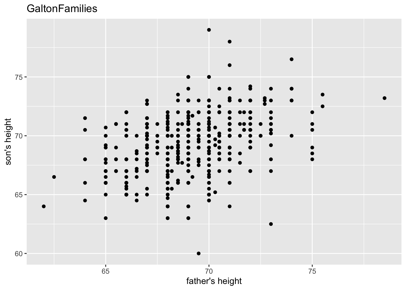
gf %>% filter(gender == "female") %>%
  ggplot() +
  geom_point(aes(mother, childHeight)) +
  labs(title = "GaltonFamilies", x = "mother's height", y = "daughter's height")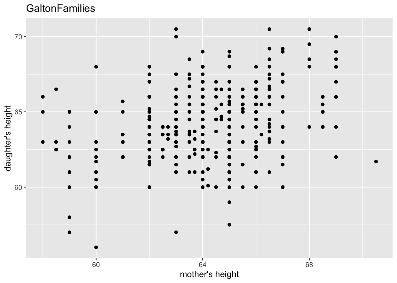
“The heights of descendants of tall ancestors tend to regress down towards a normal average (a phenomenon also known as regression toward the mean).”
gf %>% filter(gender == "male") %>%
  ggplot(aes(father, childHeight)) +
  geom_point() +
  geom_smooth(method = "lm", se = FALSE) +
  labs(title = "GaltonFamilies", x = "father's height", y = "son's height")
#> `geom_smooth()` using formula = 'y ~ x'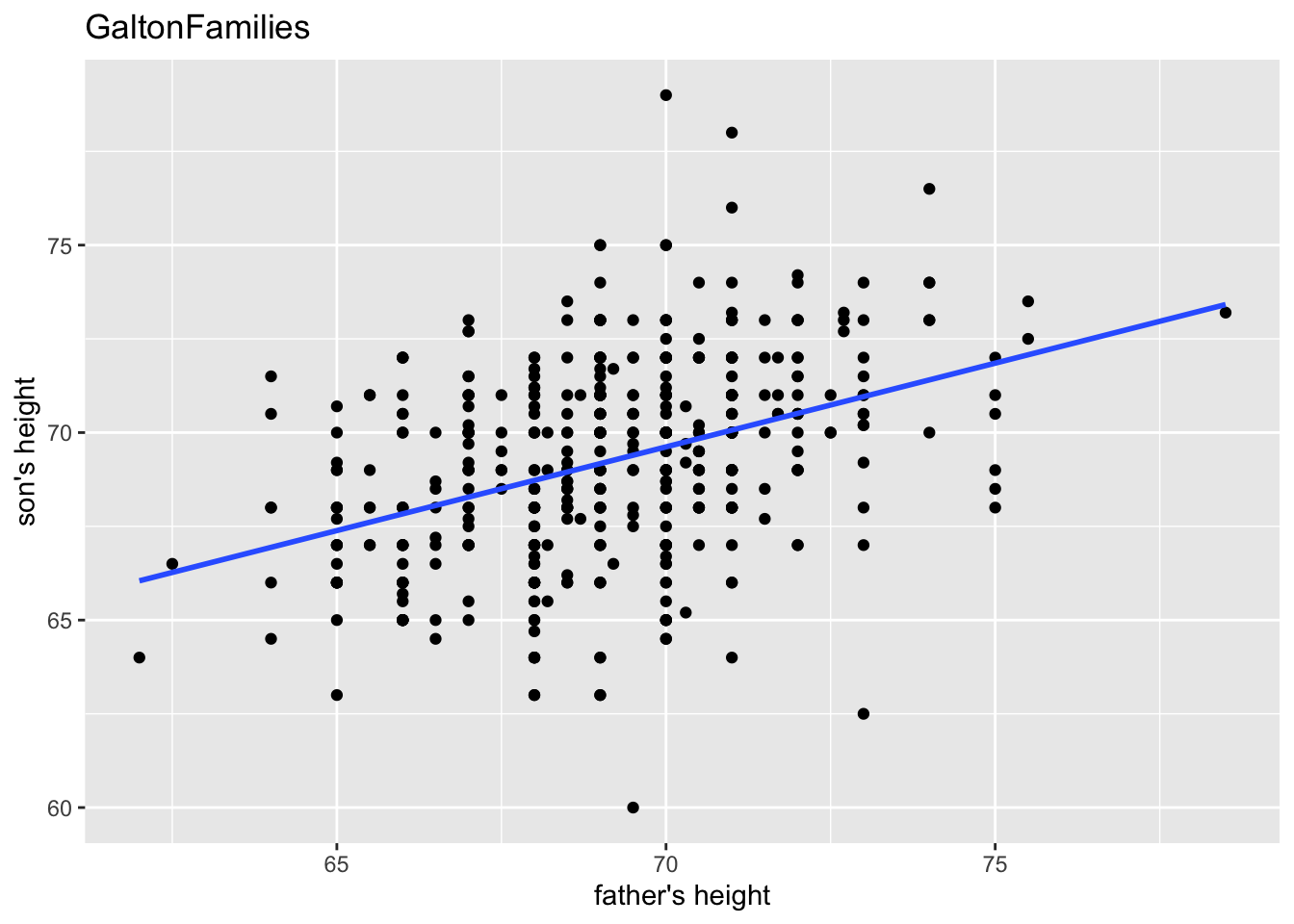
gf %>% filter(gender == "female") %>%
  ggplot(aes(mother, childHeight)) +
  geom_point() +
  geom_smooth(method = "lm", se = FALSE) +
  labs(title = "GaltonFamilies", x = "mother's height", y = "daughter's height")
#> `geom_smooth()` using formula = 'y ~ x'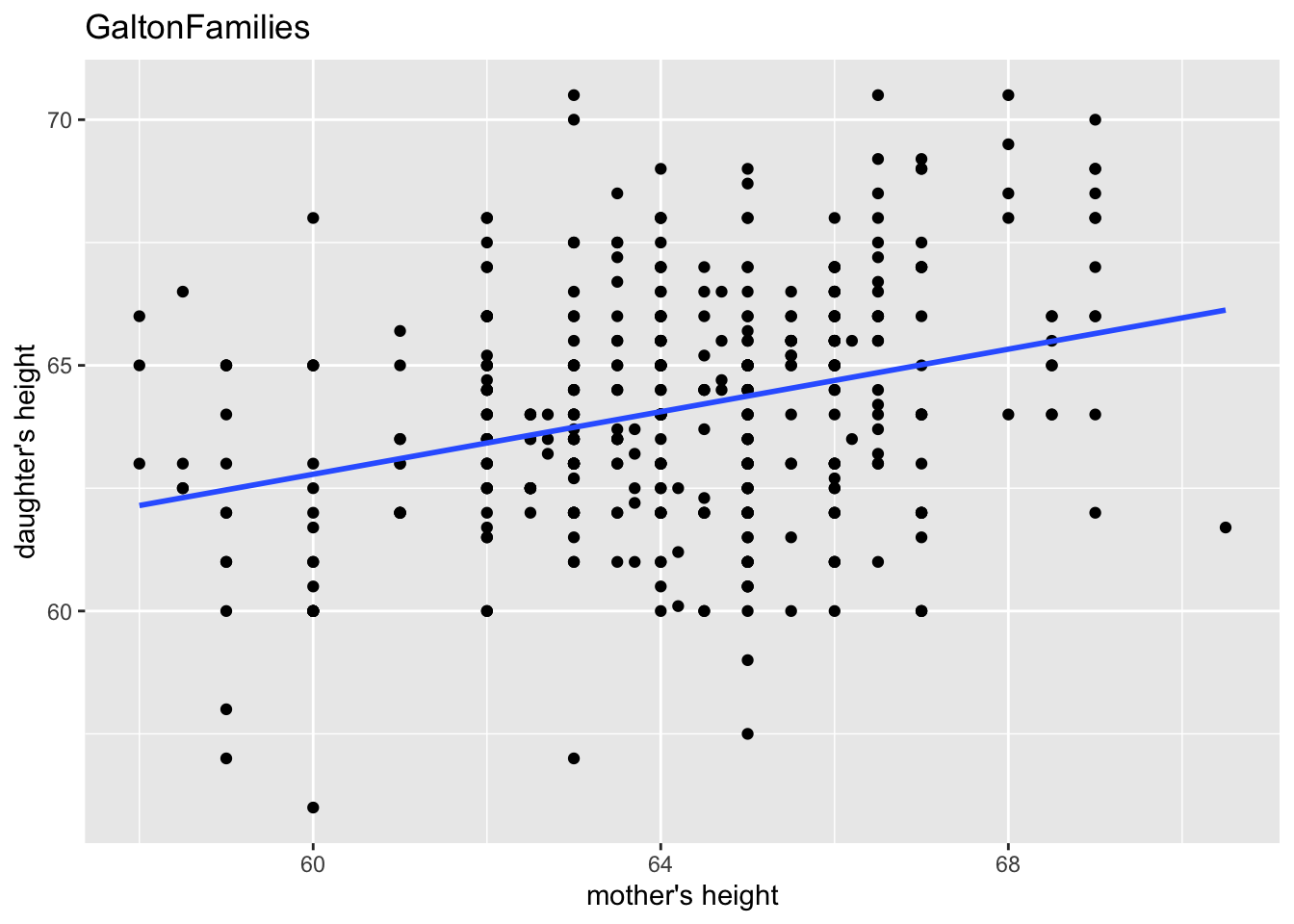
gf %>% filter(gender == "male") %>%
  lm(childHeight ~ father, data = .) %>% summary()
#>
#> Call:
#> lm(formula = childHeight ~ father, data = .)
#>
#> Residuals:
#>     Min      1Q  Median      3Q     Max
#> -9.3959 -1.5122  0.0413  1.6217  9.3808
#>
#> Coefficients:
#>             Estimate Std. Error t value Pr(>|t|)
#> (Intercept) 38.36258    3.30837  11.596   <2e-16 ***
#> father       0.44652    0.04783   9.337   <2e-16 ***
#> ---
#> Signif. codes:
#> 0 '***' 0.001 '**' 0.01 '*' 0.05 '.' 0.1 ' ' 1
#>
#> Residual standard error: 2.416 on 479 degrees of freedom
#> Multiple R-squared:  0.154,  Adjusted R-squared:  0.1522
#> F-statistic: 87.17 on 1 and 479 DF,  p-value: < 2.2e-16
gf %>% filter(gender == "female") %>%
  lm(childHeight ~ mother, data = .) %>% summary()
#>
#> Call:
#> lm(formula = childHeight ~ mother, data = .)
#>
#> Residuals:
#>     Min      1Q  Median      3Q     Max
#> -6.8749 -1.5340  0.0799  1.4434  6.7616
#>
#> Coefficients:
#>             Estimate Std. Error t value Pr(>|t|)
#> (Intercept) 43.68897    3.00171  14.555  < 2e-16 ***
#> mother       0.31824    0.04676   6.805 3.22e-11 ***
#> ---
#> Signif. codes:
#> 0 '***' 0.001 '**' 0.01 '*' 0.05 '.' 0.1 ' ' 1
#>
#> Residual standard error: 2.246 on 451 degrees of freedom
#> Multiple R-squared:  0.09313,    Adjusted R-squared:  0.09111
#> F-statistic: 46.31 on 1 and 451 DF, p-value: 3.222e-11- midparentHeight:
mid-parent height, calculated as (father + 1.08*mother)/2
gf %>% filter(gender == "male") %>%
  lm(childHeight ~ midparentHeight, data = .) %>% summary()
#>
#> Call:
#> lm(formula = childHeight ~ midparentHeight, data = .)
#>
#> Residuals:
#>     Min      1Q  Median      3Q     Max
#> -9.5431 -1.5160  0.1844  1.5082  9.0860
#>
#> Coefficients:
#>                 Estimate Std. Error t value Pr(>|t|)
#> (Intercept)     19.91346    4.08943   4.869 1.52e-06 ***
#> midparentHeight  0.71327    0.05912  12.064  < 2e-16 ***
#> ---
#> Signif. codes:
#> 0 '***' 0.001 '**' 0.01 '*' 0.05 '.' 0.1 ' ' 1
#>
#> Residual standard error: 2.3 on 479 degrees of freedom
#> Multiple R-squared:  0.2331, Adjusted R-squared:  0.2314
#> F-statistic: 145.6 on 1 and 479 DF,  p-value: < 2.2e-16