15 Assignment Five
Assignment Five: The Week Six Assignment
- Choose a public data. Clearly state how you obtained the data. Even if you are able to give the URL to download the data, explain the steps you reached and obtained the data.
- Create an R Notebook of a Data Analysis containing the following and submit the rendered HTML file (eg.
a5_123456.nb.htmlby replacing 123456 with your ID), and a PDF (or MS Word File).- create an R Notebook using the R Notebook Template in Moodle, save as
a3_123456.Rmd, - write your name and ID and the contents,
- run each code block,
- preview to create
a5_123456.nb.html, - render (or knit) PDF, or Word (and then PDF)
- submit
a5_123456.nb.htmland PDF (or Word) to Moodle.
- create an R Notebook using the R Notebook Template in Moodle, save as
-
Choose a data with at least two numerical variables. One of them can be the year.
- Information of the data
- Explain why you chose the data
- List questions you want to study
-
Explore the data using visualization using
ggplot2- Create various charts, and write observed comments
- Apply a (linear regression) model, and draw a regression line to at least one chart, and write your conclusion based on the model using the slope value and R squared (and/or adjusted R squared).
Observations based on your data visualization, and difficulties and questions encountered if any.
Due: 2023-01-30 23:59:00. Submit your R Notebook file, and a PDF file (or a MS Word file) in Moodle (The Fifth Assignment). Due on Monday!
15.1 Set up
It is better to use the following, because you can search by error message when you get an error. Error messages are important. If you get used to it, you can correct most of the errors. You can use the information given by message as well.
Sys.setenv(LANG = "en")
library(tidyverse)
#> ── Attaching core tidyverse packages ──── tidyverse 2.0.0 ──
#> ✔ dplyr     1.1.3     ✔ readr     2.1.4
#> ✔ forcats   1.0.0     ✔ stringr   1.5.0
#> ✔ ggplot2   3.4.4     ✔ tibble    3.2.1
#> ✔ lubridate 1.9.3     ✔ tidyr     1.3.0
#> ✔ purrr     1.0.2
#> ── Conflicts ────────────────────── tidyverse_conflicts() ──
#> ✖ dplyr::filter() masks stats::filter()
#> ✖ dplyr::lag()    masks stats::lag()
#> ℹ Use the conflicted package (<http://conflicted.r-lib.org/>) to force all conflicts to become errors
library(readxl) # for excel files
library(WDI)
15.1.1 World Development Indicator - WDI
The following is useful when you use WDI.
wdi_cache <- WDIcache()
15.1.1.1 Creating a vector with iso2 codes
It is convenient to have a vector with iso2c codes when you import data from WDI.
asean <- c("Brunei Darussalam", "Cambodia", "Lao PDR", "Myanmar",
           "Philippines", "Indonesia", "Malaysia", "Singapore")
brics <- c("Brazil", "Russian Federation", "India", "China")
g7 <- c("Canada", "France", "Italy", "Japan", "Germany", "United Kingdom", "United States")
income_levels <- c("High income","Upper middle income", "Middle income",
                   "Lower middle income","Low income")
ASEAN <- wdi_cache$country %>% filter(country %in% asean) %>%
  distinct(iso2c) %>% pull()
ASEAN
#> [1] "BN" "ID" "KH" "LA" "MM" "MY" "PH" "SG"
BRICs <- wdi_cache$country %>% filter(country %in% brics) %>%
  distinct(iso2c) %>% pull()
BRICs
#> [1] "BR" "CN" "IN" "RU"
G7 <- wdi_cache$country %>% filter(country %in% g7) %>%
  distinct(iso2c) %>% pull()
G7
#> [1] "CA" "DE" "FR" "GB" "IT" "JP" "US"
INCOME_LEVELS <- wdi_cache$country %>% filter(country %in% income_levels) %>%
  distinct(iso2c) %>% pull()
INCOME_LEVELS
#> [1] "XD" "XM" "XN" "XP" "XT"- In the following code chunk, we import only the G7 countries.
wdi_cache$series %>% filter(indicator %in% c("SG.GEN.PARL.ZS","SI.POV.GINI"))
#>        indicator
#> 1 SG.GEN.PARL.ZS
#> 2    SI.POV.GINI
#>                                                            name
#> 1 Proportion of seats held by women in national parliaments (%)
#> 2                                                    Gini index
#>                                                                                                                                                                                                                                                                                                                                                                                                                                                                                                                                                                                                                                                            description
#> 1                                                                                                                                                                                                                                                                                                                                                                                                                                                                                                                                                           Women in parliaments are the percentage of parliamentary seats in a single or lower chamber held by women.
#> 2 Gini index measures the extent to which the distribution of income (or, in some cases, consumption expenditure) among individuals or households within an economy deviates from a perfectly equal distribution. A Lorenz curve plots the cumulative percentages of total income received against the cumulative number of recipients, starting with the poorest individual or household. The Gini index measures the area between the Lorenz curve and a hypothetical line of absolute equality, expressed as a percentage of the maximum area under the line. Thus a Gini index of 0 represents perfect equality, while an index of 100 implies perfect inequality.
#>                 sourceDatabase
#> 1 World Development Indicators
#> 2 World Development Indicators
#>                                                                                                                                                                                                                                                                                                                               sourceOrganization
#> 1                                                                                                                                                                                                                                       Inter-Parliamentary Union (IPU) (www.ipu.org).  For the year of 1998, the data is as of August 10, 1998.
#> 2 World Bank, Poverty and Inequality Platform. Data are based on primary household survey data obtained from government statistical agencies and World Bank country departments. Data for high-income economies are mostly from the Luxembourg Income Study database. For more information and methodology, please see http://pip.worldbank.org.
df1 <- WDI(country = G7,
           indicator=c(parl = "SG.GEN.PARL.ZS", gini = "SI.POV.GINI"),
           extra=TRUE, cache=wdi_cache)
df1 %>% slice(1:10)  # for R Notebook use this line, for PDF delete by adding #
#>    country iso2c iso3c year status lastupdated parl gini
#> 1   Canada    CA   CAN 1960         2023-10-26   NA   NA
#> 2   Canada    CA   CAN 1961         2023-10-26   NA   NA
#> 3   Canada    CA   CAN 1962         2023-10-26   NA   NA
#> 4   Canada    CA   CAN 1963         2023-10-26   NA   NA
#> 5   Canada    CA   CAN 1964         2023-10-26   NA   NA
#> 6   Canada    CA   CAN 1965         2023-10-26   NA   NA
#> 7   Canada    CA   CAN 1966         2023-10-26   NA   NA
#> 8   Canada    CA   CAN 1967         2023-10-26   NA   NA
#> 9   Canada    CA   CAN 1968         2023-10-26   NA   NA
#> 10  Canada    CA   CAN 1969         2023-10-26   NA   NA
#>           region capital longitude latitude      income
#> 1  North America  Ottawa  -75.6919  45.4215 High income
#> 2  North America  Ottawa  -75.6919  45.4215 High income
#> 3  North America  Ottawa  -75.6919  45.4215 High income
#> 4  North America  Ottawa  -75.6919  45.4215 High income
#> 5  North America  Ottawa  -75.6919  45.4215 High income
#> 6  North America  Ottawa  -75.6919  45.4215 High income
#> 7  North America  Ottawa  -75.6919  45.4215 High income
#> 8  North America  Ottawa  -75.6919  45.4215 High income
#> 9  North America  Ottawa  -75.6919  45.4215 High income
#> 10 North America  Ottawa  -75.6919  45.4215 High income
#>           lending
#> 1  Not classified
#> 2  Not classified
#> 3  Not classified
#> 4  Not classified
#> 5  Not classified
#> 6  Not classified
#> 7  Not classified
#> 8  Not classified
#> 9  Not classified
#> 10 Not classified
15.1.2 World Inequility Report - WIR2022
- World Inequality Report: https://wir2022.wid.world/
- Executive Summary: https://wir2022.wid.world/executive-summary/
- Methodology: https://wir2022.wid.world/methodology/
- URL of Executive Summary Data: https://wir2022.wid.world/www-site/uploads/2022/03/WIR2022TablesFigures-Summary.xlsx
Please add mode="wb" (web binary). This should work better.
url_summary <- "https://wir2022.wid.world/www-site/uploads/2022/03/WIR2022TablesFigures-Summary.xlsx"
download.file(url = url_summary,
              destfile = "./data/WIR2022s.xlsx",
              mode = "wb")
If you get an error, download the file directory from the methodology site into your computer, then open it with Excel and save it in the data folder of your R Studio project. Then R studio can recognize it easily as an Excel data.
Generally, a text file such as a CSV file is easy to import, but a binary file is difficult to handle. It is because unless R can recognize its file type, for example, Excel or so, R cannot import the data.
excel_sheets("./data/WIR2022s.xlsx")
#>  [1] "Index"     "F1"        "F2"        "F3"
#>  [5] "F4"        "F5."       "F6"        "F7"
#>  [9] "F8"        "F9"        "F10"       "F11"
#> [13] "F12"       "F13"       "F14"       "F15"
#> [17] "T1"        "data-F1"   "data-F2"   "data-F3"
#> [21] "data-F4"   "data-F5"   "data-F6"   "data-F7"
#> [25] "data-F8"   "data-F9"   "data-F10"  "data-F11"
#> [29] "data-F12"  "data-F13." "data-F14." "data-F15"
15.2 General Comments
15.2.1 Create a PDF or Word file.
A Notebook file is created by pressing the Preview button, and the outputs appear as is. However, making a file with another format, R runs all code chunks from the top. So if the object is not defined above the code used, the knit program stops with an error message. I recommend the following steps.
Create a PDF right after you create a new (R Notebook) file (using Template). By this step, you can check your ‘Knit to PDF’ process by
tinytexis working well. Please let me know if you fail to create a PDF and cannot solve the problem. I will look at the setting of your PC in class.Run all codes before you preview Notebook. You can use ‘Run All’, and ‘Run All Code Chunks Below’ under the ‘Run’ button if there is an incomplete code chunk.
Before you create a PDF or word, you need to correct all errors. But if you could not, add
eval = FALSEas an option.
You can add a similar option from the gear mark at the top right in the code chunk. Select show nothing (don’t run code); it adds {r eval = FALSE, include = FALSE}, and the code chunk itself is skipped.
- Rerun all. If you can reach the end of the file without having an error, ‘Knit to PDF’ or ‘Knit to Word’.
Creating a Word file is similar, and should be more accessible.
If you fail to create a PDF using Knit to PDF or Knit to Word, the alternative is to open the notebook wile with nb.html at the end in your web browser, such as Google Chrome, Edge, or Safari, and use the functionality of printing to PDF of your browser.
15.2.1.1 Other Code Chunk Options
Please review EDA5, and try options under the gear mark at the top right of each code chunk. I will add two useful options, I use often
-
cash = TRUEoption. Downloading data and accessing to the internet takes time, and may cause trouble for the hosting site. With this option, you can avoid it, and shorten the compilation time to render. I always add this option toWDI(). As forWDIsearch(), if you usecache = wdi_cache, you do not need to add this option. It is another benefit to usecache = wdi_cache.
-
echo = FALSEoption. When you create a PDF with a limit of pages, you do not want to include some code chunks. Then use this option. The output is included, but the code chunk is not. You can select this option by choosing ’Show output only` option.
15.2.1.2 Reference
- https://yihui.org/knitr/options/
- Cheat Sheet. We distributed in class. You can download the same from Help: Cheatsheet at the top menu of R Stduio.
15.2.1.3 Long Table
If you do not want to include a long table in your PDF or Word, use the following.
wdi_cache$series %>% slice(1:10)
#>               indicator
#> 1    1.0.HCount.1.90usd
#> 2     1.0.HCount.2.5usd
#> 3  1.0.HCount.Mid10to50
#> 4       1.0.HCount.Ofcl
#> 5   1.0.HCount.Poor4uds
#> 6   1.0.HCount.Vul4to10
#> 7      1.0.PGap.1.90usd
#> 8       1.0.PGap.2.5usd
#> 9     1.0.PGap.Poor4uds
#> 10     1.0.PSev.1.90usd
#>                                       name
#> 1          Poverty Headcount ($1.90 a day)
#> 2          Poverty Headcount ($2.50 a day)
#> 3    Middle Class ($10-50 a day) Headcount
#> 4  Official Moderate Poverty Rate-National
#> 5             Poverty Headcount ($4 a day)
#> 6       Vulnerable ($4-10 a day) Headcount
#> 7                Poverty Gap ($1.90 a day)
#> 8                Poverty Gap ($2.50 a day)
#> 9                   Poverty Gap ($4 a day)
#> 10          Poverty Severity ($1.90 a day)
#>                                                                                                                                                                                                                                                                    description
#> 1                                                                                                                                     The poverty headcount index measures the proportion of the population with daily per capita income (in 2011 PPP) below the poverty line.
#> 2                                                                                                                                     The poverty headcount index measures the proportion of the population with daily per capita income (in 2005 PPP) below the poverty line.
#> 3                                                                                                                                     The poverty headcount index measures the proportion of the population with daily per capita income (in 2005 PPP) below the poverty line.
#> 4                                                                                                                The poverty headcount index measures the proportion of the population with daily per capita income below the official poverty line developed by each country.
#> 5                                                                                                                                     The poverty headcount index measures the proportion of the population with daily per capita income (in 2005 PPP) below the poverty line.
#> 6                                                                                                                                     The poverty headcount index measures the proportion of the population with daily per capita income (in 2005 PPP) below the poverty line.
#> 7  The poverty gap captures the mean aggregate income or consumption shortfall relative to the poverty line across the entire population. It measures the total resources needed to bring all the poor to the level of the poverty line (averaged over the total population).
#> 8  The poverty gap captures the mean aggregate income or consumption shortfall relative to the poverty line across the entire population. It measures the total resources needed to bring all the poor to the level of the poverty line (averaged over the total population).
#> 9  The poverty gap captures the mean aggregate income or consumption shortfall relative to the poverty line across the entire population. It measures the total resources needed to bring all the poor to the level of the poverty line (averaged over the total population).
#> 10                                                                                                        The poverty severity index combines information on both poverty and inequality among the poor by averaging the squares of the poverty gaps relative the poverty line
#>    sourceDatabase
#> 1  LAC Equity Lab
#> 2  LAC Equity Lab
#> 3  LAC Equity Lab
#> 4  LAC Equity Lab
#> 5  LAC Equity Lab
#> 6  LAC Equity Lab
#> 7  LAC Equity Lab
#> 8  LAC Equity Lab
#> 9  LAC Equity Lab
#> 10 LAC Equity Lab
#>                                                       sourceOrganization
#> 1      LAC Equity Lab tabulations of SEDLAC (CEDLAS and the World Bank).
#> 2      LAC Equity Lab tabulations of SEDLAC (CEDLAS and the World Bank).
#> 3      LAC Equity Lab tabulations of SEDLAC (CEDLAS and the World Bank).
#> 4  LAC Equity Lab tabulations of data from National Statistical Offices.
#> 5      LAC Equity Lab tabulations of SEDLAC (CEDLAS and the World Bank).
#> 6      LAC Equity Lab tabulations of SEDLAC (CEDLAS and the World Bank).
#> 7      LAC Equity Lab tabulations of SEDLAC (CEDLAS and the World Bank).
#> 8      LAC Equity Lab tabulations of SEDLAC (CEDLAS and the World Bank).
#> 9      LAC Equity Lab tabulations of SEDLAC (CEDLAS and the World Bank).
#> 10     LAC Equity Lab tabulations of SEDLAC (CEDLAS and the World Bank).
This will print only the first ten rows. The following R Basic code does almost the same.
head(wdi_cache$country, 10)
#>    iso3c iso2c                     country
#> 1    ABW    AW                       Aruba
#> 2    AFE    ZH Africa Eastern and Southern
#> 3    AFG    AF                 Afghanistan
#> 4    AFR    A9                      Africa
#> 5    AFW    ZI  Africa Western and Central
#> 6    AGO    AO                      Angola
#> 7    ALB    AL                     Albania
#> 8    AND    AD                     Andorra
#> 9    ARB    1A                  Arab World
#> 10   ARE    AE        United Arab Emirates
#>                        region          capital longitude
#> 1   Latin America & Caribbean       Oranjestad  -70.0167
#> 2                  Aggregates
#> 3                  South Asia            Kabul   69.1761
#> 4                  Aggregates
#> 5                  Aggregates
#> 6          Sub-Saharan Africa           Luanda    13.242
#> 7       Europe & Central Asia           Tirane   19.8172
#> 8       Europe & Central Asia Andorra la Vella    1.5218
#> 9                  Aggregates
#> 10 Middle East & North Africa        Abu Dhabi   54.3705
#>    latitude              income        lending
#> 1   12.5167         High income Not classified
#> 2                    Aggregates     Aggregates
#> 3   34.5228          Low income            IDA
#> 4                    Aggregates     Aggregates
#> 5                    Aggregates     Aggregates
#> 6  -8.81155 Lower middle income           IBRD
#> 7   41.3317 Upper middle income           IBRD
#> 8   42.5075         High income Not classified
#> 9                    Aggregates     Aggregates
#> 10  24.4764         High income Not classified
15.3 Your Work
Here is a list of data your classmates used for Assignment Five.
15.3.1 World Development Indicators - WDI
- SP.POP.TOTL: Population, total
- NY.GDP.MKTP.KD.ZG: GDP annual growth
- NY.GDP.MKTP.CD: GDP (current US$)
- NY.GDP.MKTP.KD.ZG: GDP growth (annual %)
- NY.GDP.PCAP.KD: GDP per capita (constant 2015 US$)
- NY.GNS.ICTR.ZS: Gross savings (% of GDP)
- BX.TRF.PWKR.CD.DT: Personal remittances, received (current US$)
- SI.POV.GINI: Gini index
- SL.TLF.TOTL.FE.ZS: Labor force, female (% of total labor force)
- SI.DST.10TH.10: Income share held by highest 10%
- SL.UEM.TOTL.ZS: Unemployment, total (% of total labor force) (modeled ILO estimate)
- BX.KLT.DINV.CD.WD: Foreign Direct Investment (FDI)
- AG.LND.FRST.K2: Forest area (sq. km)
- EN.ATM.CO2E.KT: CO2 emissions (kt)
- EG.USE.ELEC.KH.PC:Electric power consumption (kWh per capita)
- FB.ATM.TOTL.P5: Automated teller machines (ATMs) (per 100,000 adults)
- SM.POP.REFG.OR: Refugee population by country or territory of origin
- SG.GEN.PARL.ZS: Proportion of seats held by women in national parliaments (%)
- SE.XPD.TOTL.GD.ZS: Government expenditure on education, total (% of GDP)
- GB.XPD.RSDV.GD.ZS: Research and development expenditure (% of GDP)
- SE.SEC.ENRR: School enrollment rate, secondary (% gross)
- IP.PAT.RESD: Patent applications, residents
- IP.IDS.RSCT: Industrial design applications, resident, by count
- IP.JRN.ARTC.SC: Scientific and technical journal articles
- BM.GSR.ROYL.CD: Intellectual Property Payments (BOP, Current US$)
15.3.2 Worldbank Data
- Climate Change Knowledge Portal: https://climateknowledgeportal.worldbank.org
- country summary
15.3.3 OECD Data
- Public spending on education: https://data.oecd.org/eduresource/public-spending-on-education.htm
- Private spending on education: https://data.oecd.org/eduresource/private-spending-on-education.htm
15.3.4 WIR Data
- Executive Summary: https://wir2022.wid.world/executive-summary/
15.3.5 Toy Data
-
datasets::mtcars: Motor Trend Car Road Tests
15.4 Responses to Questions
15.4.1 Q. How can we include values in the graphs
A. Use geom_text(). Sometimes geom_label() works better.
The first example is for geom_column().
-
geom_textorgeom_label-
aes(country, gini, label = gini): x and y value together with the data you want to include. In this case, I chose the same x and y value asgeom_com(), andginifor the value. -
vjust: Change the value to find the best location. You can also usehjust, for the horizontal justification.
-
df1 %>% filter(country %in% g7, year == 2013) %>%
  ggplot(aes(country, gini, fill = country)) + geom_col() +
  geom_text(aes(label = gini), vjust = -0.1) + labs(x = "") +
  theme(legend.position = "none")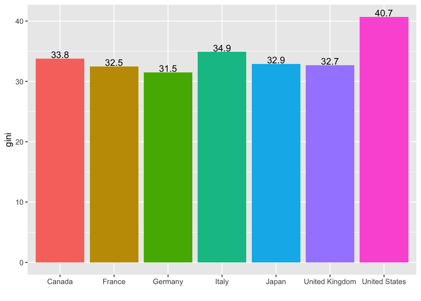
I do not think the following charts are fancy, but you can apply these techniques when appropriate.
- Scatter plot, and line plot
-
aes(label = paste("(",gini,",", round(parl,1),")"): x and y value together with the data you want to include. In this case, I included theginivalue and theparlvalue, surrounded by parentheses. However, theparlvalue has long decimal places; I usedroundto cut it shorter to keep only one decimal place. -
vjust = -0.1: Just above the point. -
size = 3: Used a bit smaller font size. -
geom_line(arrow = arrow(length = unit(0.03, "npc"), ends="last", type = "closed")): Added line segments with arrow heads. -
ylim(5,40), xlim(29,42): The range of the coordinate plane to include labels.
-
- Compare with
geom_label.- I also changed the shape of the arrow heads.
df1 %>% filter(country %in% g7, year %in% c(2010, 2013)) %>%
  ggplot(aes(gini, parl, color = country)) + geom_point(aes(shape = factor(year))) +
  geom_text(aes(label = paste("(",gini,",", round(parl,1),")")), vjust = -0.1, size = 3) +
  geom_line(arrow = arrow(length = unit(0.03, "npc"), ends="last", type = "closed")) + ylim(5,40) + xlim(29,42)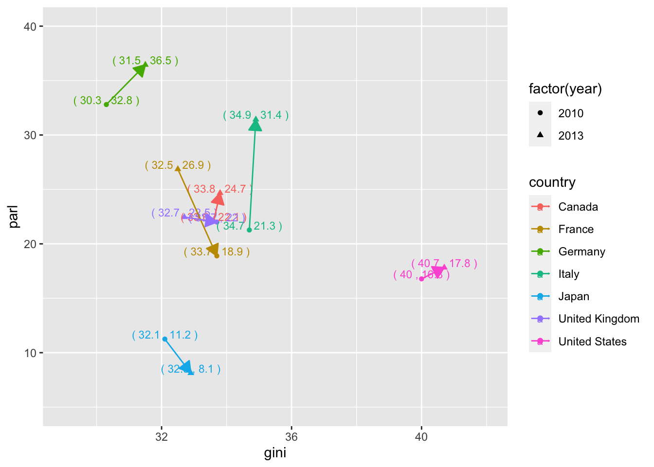
df1 %>% filter(country %in% g7, year %in% c(2010, 2013)) %>%
  ggplot(aes(gini, parl, color = country)) + geom_point(aes(shape = factor(year))) +
  geom_label(aes(gini, parl, label = iso2c), vjust = -0.1, size = 3) +
  geom_line(aes(gini, parl, color = country), arrow = arrow(length = unit(0.03, "npc"), ends="last", type = "open"))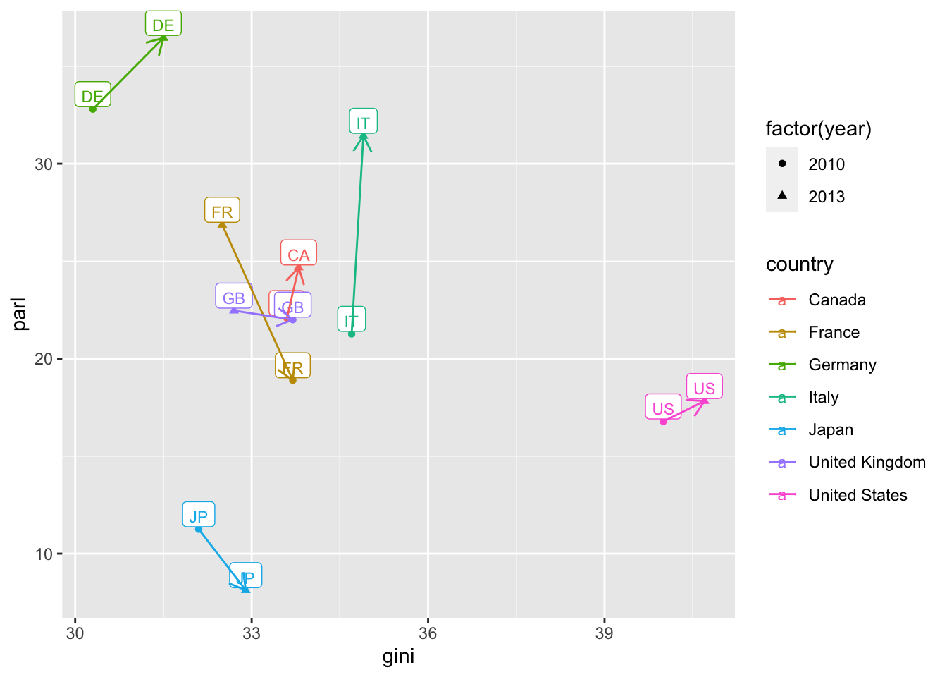
See Responses to Assignment Four, See 4.4.
https://icu-hsuzuki.github.io/da4r2022_note/a4_resp.nb.html
See also:
https://ds-sl.github.io/data-analysis/wir2022.nb.html
Explanation of F1.
15.5 My Comments after Review
15.5.1 NA values
It is challenging to handle NA values properly. Let me introduce basics. In the following we use two data sets. One is df1 used above, containing the indicator related the women’s sheet in parliament and the GINI index, and the following data on the forest area.
wdi_cache$series %>% filter(indicator == "AG.LND.FRST.K2")
#>        indicator                 name
#> 1 AG.LND.FRST.K2 Forest area (sq. km)
#>                                                                                                                                                                                                                                                                            description
#> 1 Forest area is land under natural or planted stands of trees of at least 5 meters in situ, whether productive or not, and excludes tree stands in agricultural production systems (for example, in fruit plantations and agroforestry systems) and trees in urban parks and gardens.
#>                 sourceDatabase
#> 1 World Development Indicators
#>                                                  sourceOrganization
#> 1 Food and Agriculture Organization, electronic files and web site.
df2 <- WDI(country = "all", indicator = c(area = "AG.LND.FRST.K2"), extra = TRUE, cache = wdi_cache)
df2 %>% slice(1:10)
#>        country iso2c iso3c year    area status lastupdated
#> 1  Afghanistan    AF   AFG 2013 12084.4         2023-10-26
#> 2  Afghanistan    AF   AFG 2012 12084.4         2023-10-26
#> 3  Afghanistan    AF   AFG 2011 12084.4         2023-10-26
#> 4  Afghanistan    AF   AFG 2022      NA         2023-10-26
#> 5  Afghanistan    AF   AFG 2021 12084.4         2023-10-26
#> 6  Afghanistan    AF   AFG 2020 12084.4         2023-10-26
#> 7  Afghanistan    AF   AFG 2019 12084.4         2023-10-26
#> 8  Afghanistan    AF   AFG 2018 12084.4         2023-10-26
#> 9  Afghanistan    AF   AFG 2017 12084.4         2023-10-26
#> 10 Afghanistan    AF   AFG 2016 12084.4         2023-10-26
#>        region capital longitude latitude     income lending
#> 1  South Asia   Kabul   69.1761  34.5228 Low income     IDA
#> 2  South Asia   Kabul   69.1761  34.5228 Low income     IDA
#> 3  South Asia   Kabul   69.1761  34.5228 Low income     IDA
#> 4  South Asia   Kabul   69.1761  34.5228 Low income     IDA
#> 5  South Asia   Kabul   69.1761  34.5228 Low income     IDA
#> 6  South Asia   Kabul   69.1761  34.5228 Low income     IDA
#> 7  South Asia   Kabul   69.1761  34.5228 Low income     IDA
#> 8  South Asia   Kabul   69.1761  34.5228 Low income     IDA
#> 9  South Asia   Kabul   69.1761  34.5228 Low income     IDA
#> 10 South Asia Kabul 69.1761 34.5228 Low income IDA- Get rid of all NA values. nrow(data) gives the number of rows, the length of data.
- Drop data only a specified indicator.
Can you see why the number above is larger than the row number of df2_wona? Since there are many column imported using extra=TRUE, there may be NA values in the othre columns.
So, generally speaking, it is better to drop NA only for the indicators.
- Selecting year or other conditions with many data.
I chose the year 2013 and 2010, because those are the only years we had data for all G7 countries with two indicator values, i.e., parl and gini.
df1 %>% drop_na(parl, gini) %>%
  group_by(year) %>% summarize(n = n()) %>%
  arrange(desc(n), desc(year)) %>% top_n(1)
#> Selecting by n
#> # A tibble: 3 × 2
#>    year     n
#>   <int> <int>
#> 1  2013     7
#> 2  2010     7
#> 3 2008 7- Compare the following charts. In the second chart, we can get rid of the warnings. You can simply remove the warning by adding a chunk optiion
warning=FALSEby {r warning=FALSE} or choosing an option using the gear mark.
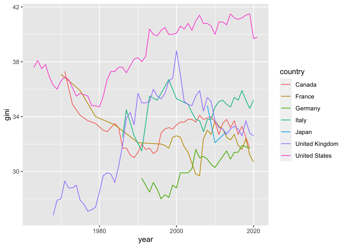
df1 %>% ggplot(aes(x = year, y = gini, col = country)) + geom_line()
#> Warning: Removed 159 rows containing missing values
#> (`geom_line()`).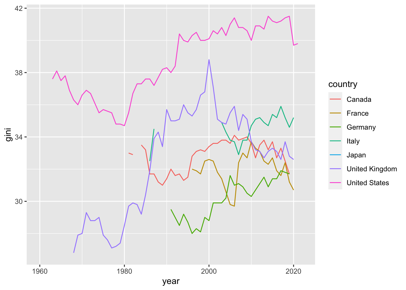
15.5.1.1 Reference
- Posit Primers: Tidy Your Data
15.5.2 Comparing Two
There are several ways if you want to compare two charts. You can incllude them in one chart, as I gave examples above using geom_line with arrows.
We want to combine the following charts into one. A few comments on the charts.
- Since
yearis fixed, we setx = ""inlabsand add a title specifying the year. -
scale_x_discrete(labels = function(x) stringr::str_wrap(x, width = 7)): Since the labels of the x-axis are long, we used a unique technique to wrap the tags to fit into a fixed length. -
theme(legend. position = "none"): Since the legend is the same as the labels, we removed it.
df2_wona_area %>% filter(region %in% c("East Asia & Pacific", "Europe & Central Asia", "Latin America & Caribbean", "Middle East & North Africa", "North America", "South Asia", "Sub-Saharan Africa"), year == 1990) %>%
  ggplot(aes(x = region, y = area, fill = region)) +
  geom_col() + labs(title = "Graph 1. Forest areas in 1990", x = "", y = "Forest area (sq. km)") + scale_x_discrete(labels = function(x) stringr::str_wrap(x, width = 7)) +
  theme(legend.position = "none")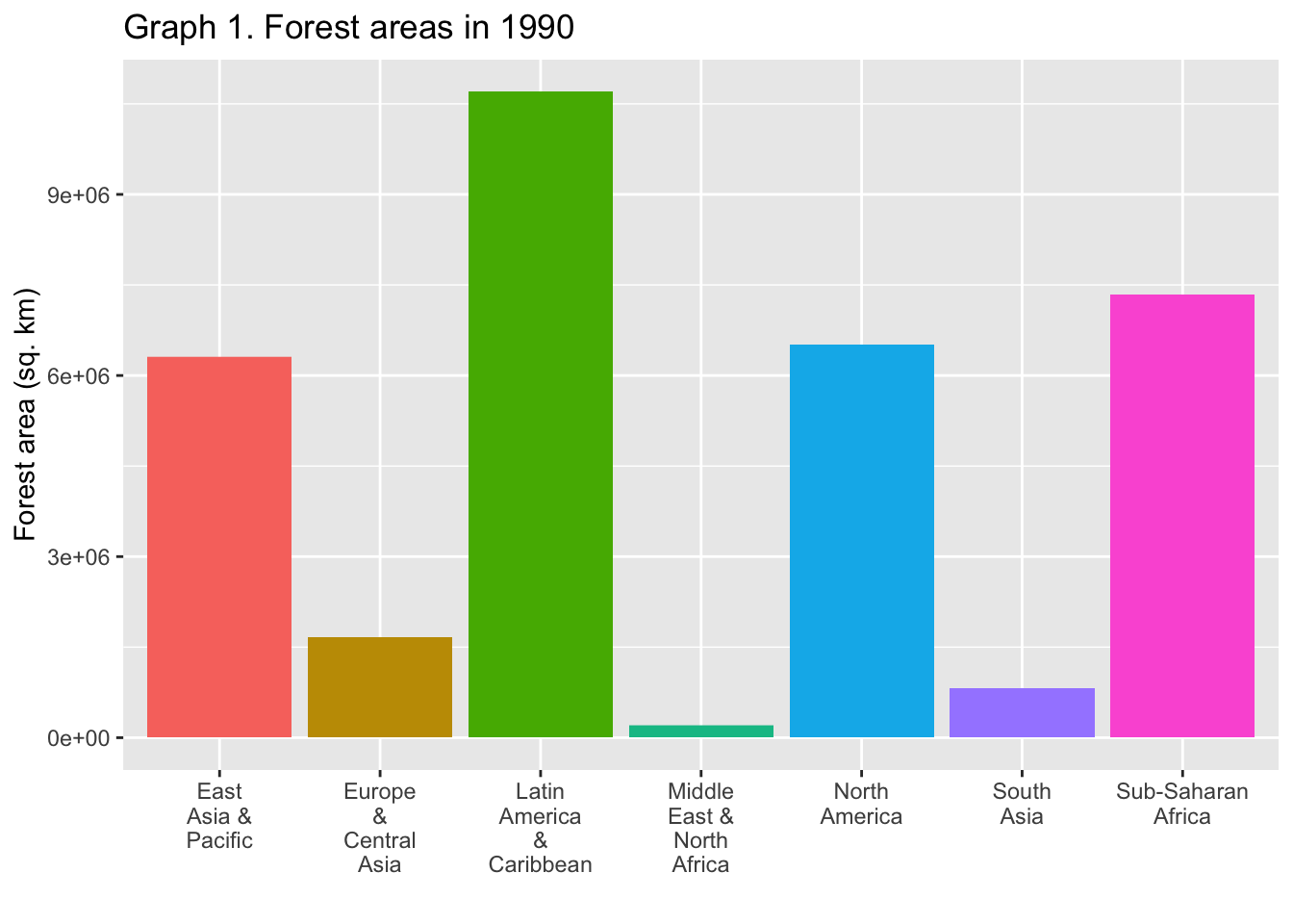
df2_wona_area %>% filter(region %in% c("East Asia & Pacific", "Europe & Central Asia", "Latin America & Caribbean", "Middle East & North Africa", "North America", "South Asia", "Sub-Saharan Africa"), year == 2020) %>%
  ggplot(aes(x = region, y = area, fill = region)) +
  geom_col() + labs(title = "Graph 2. Forest areas in 2020", subtitle = "Regions of the world", x = "", y = "Forest area (sq. km)") + scale_x_discrete(labels = function(x) stringr::str_wrap(x, width = 7)) +
  theme(legend.position = "none")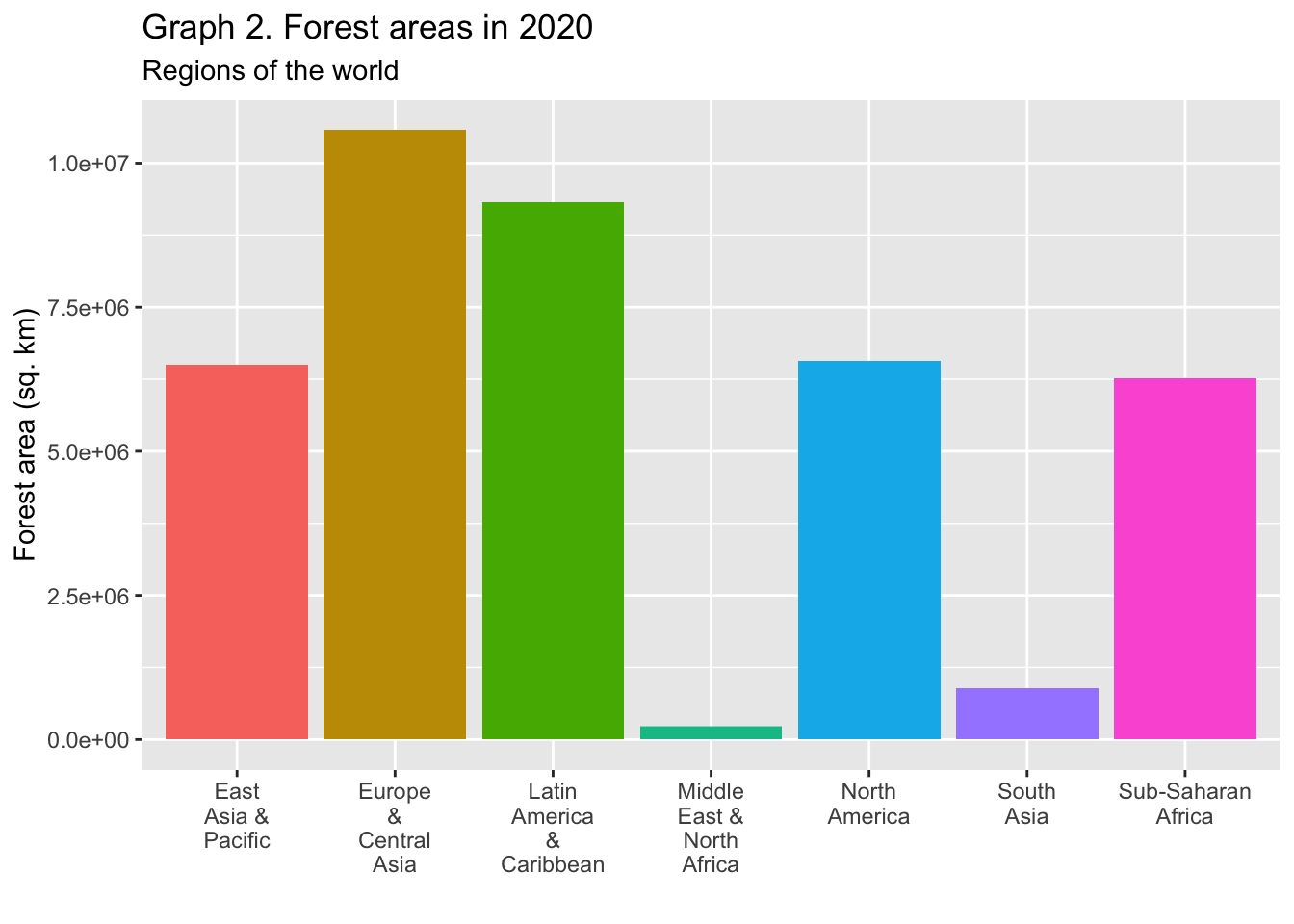
- position(“dodge”)
df2_wona_area %>% filter(region %in% c("East Asia & Pacific", "Europe & Central Asia", "Latin America & Caribbean", "Middle East & North Africa", "North America", "South Asia", "Sub-Saharan Africa"), year %in% c(1990,2020)) %>%
  ggplot(aes(x = region, y = area, fill = factor(year))) +
  geom_col(position="dodge", width = 0.8) + labs(title = "Forest areas", x = "", y = "Forest area (sq. km)", fill = "year: ") + scale_x_discrete(labels = function(x) stringr::str_wrap(x, width = 12)) +
  theme(legend.position = "top")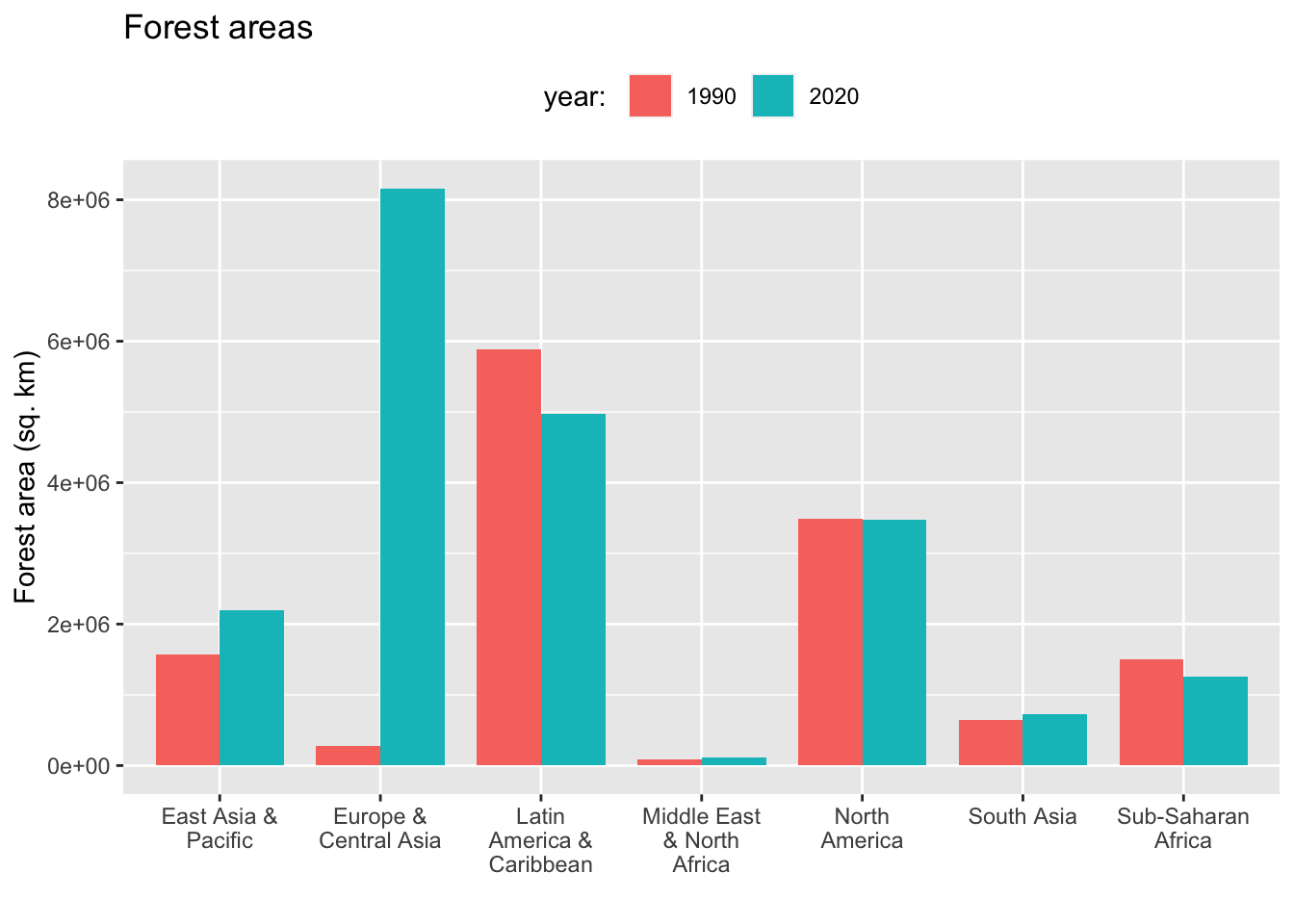
facet_wrap
df2_wona_area %>% filter(region %in% c("East Asia & Pacific", "Europe & Central Asia", "Latin America & Caribbean", "Middle East & North Africa", "North America", "South Asia", "Sub-Saharan Africa"), year %in% c(1990,2020)) %>%
  ggplot(aes(x = region, y = area, fill = region)) +
  geom_col(position="dodge", width = 0.8) + labs(title = "Forest areas", x = "", y = "Forest area (sq. km)") + scale_x_discrete(labels = function(x) stringr::str_wrap(x, width = 3)) +
  theme(legend.position = "none") + facet_wrap(.~year)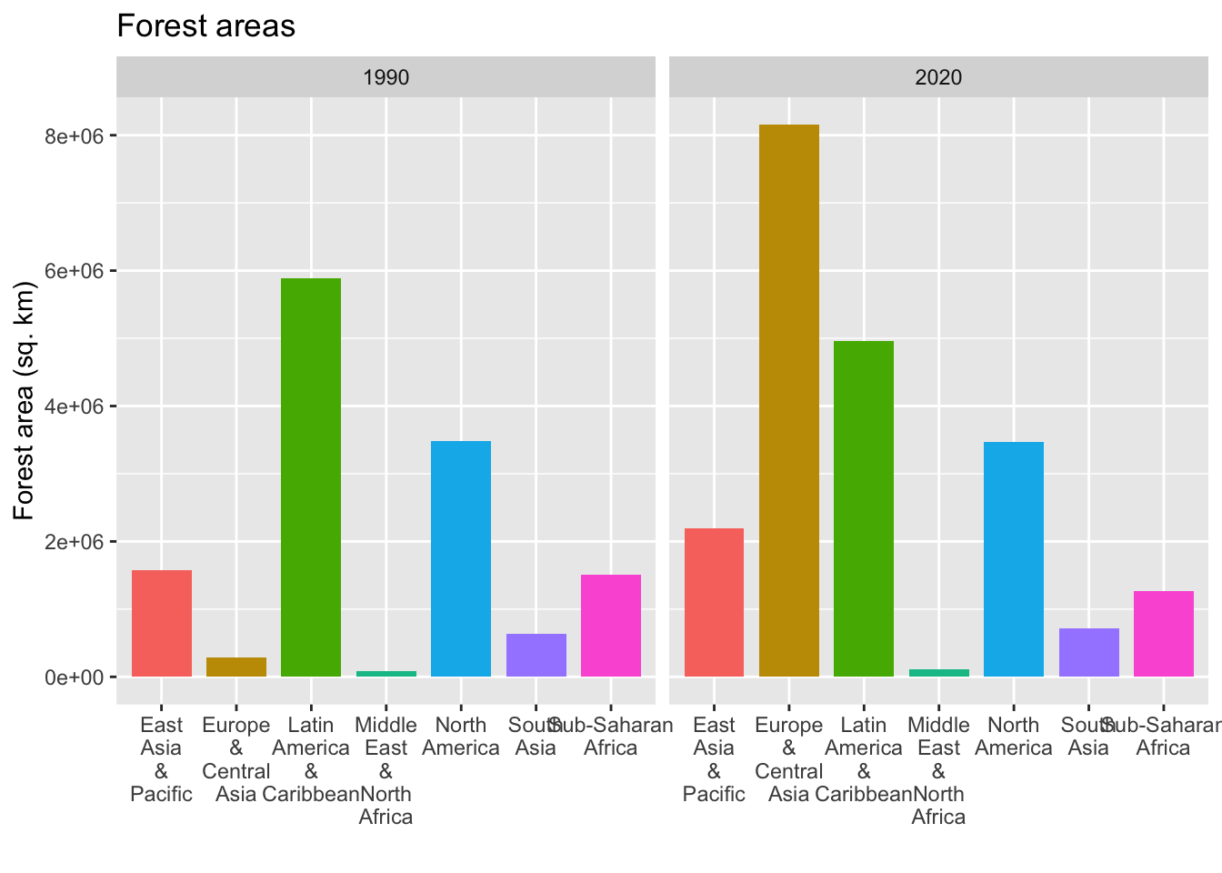
df2_wona_area %>% filter(region %in% c("East Asia & Pacific", "Europe & Central Asia", "Latin America & Caribbean", "Middle East & North Africa", "North America", "South Asia", "Sub-Saharan Africa"), year %in% c(1990,2020)) %>%
  ggplot(aes(x = region, y = area, fill = region)) +
  geom_col(position="dodge", width = 0.8) + labs(title = "Forest areas", x = "", y = "Forest area (sq. km)") + scale_x_discrete(labels = function(x) stringr::str_wrap(x, width = 3)) +
  theme(legend.position = "none") + facet_wrap(.~year, nrow = 2)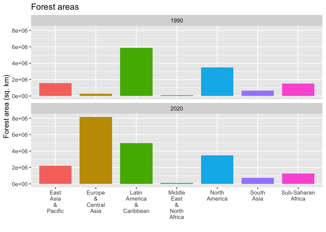
See Posit Primers: Visualize Data
15.5.3 The package broom for models
There is another package for models in tidyverse, i.e., modelr. Some of the functions of modelr can be useful, but it is mainly for sampling and machine learning. So we explain the package broom only.
Although, broom is installed when you install tidyverse, it is not loaded. So you need to add library(broom).
df3 <- datasets::irisThere are two ways to set a model.
-
lm(y~x, data)anddata %>% lm(y~x, .).
You can see model summary by the following.
-
summary(lm(y~x, data))anddata %>% lm(y~x, .) %>% summary().
mod <- df3 %>% lm(Sepal.Length ~ Sepal.Width, .)
mod
#>
#> Call:
#> lm(formula = Sepal.Length ~ Sepal.Width, data = .)
#>
#> Coefficients:
#> (Intercept)  Sepal.Width
#>      6.5262      -0.2234
df3 %>% lm(Sepal.Length ~ Sepal.Width, .) %>% summary()
#>
#> Call:
#> lm(formula = Sepal.Length ~ Sepal.Width, data = .)
#>
#> Residuals:
#>     Min      1Q  Median      3Q     Max
#> -1.5561 -0.6333 -0.1120  0.5579  2.2226
#>
#> Coefficients:
#>             Estimate Std. Error t value Pr(>|t|)
#> (Intercept)   6.5262     0.4789   13.63   <2e-16 ***
#> Sepal.Width  -0.2234     0.1551   -1.44    0.152
#> ---
#> Signif. codes:
#> 0 '***' 0.001 '**' 0.01 '*' 0.05 '.' 0.1 ' ' 1
#>
#> Residual standard error: 0.8251 on 148 degrees of freedom
#> Multiple R-squared:  0.01382,    Adjusted R-squared:  0.007159
#> F-statistic: 2.074 on 1 and 148 DF,  p-value: 0.1519
Since the coefficients are under Estimate of the summary, you think you do not need mod = lm(y~x, data). But it is not the case.
mod <- lm(y~x, data) defines a model.
15.5.4 tidy
It produces the coefficients part of the model summary. So, the two values under estimate is the y-intercept and the slope.
mod %>% tidy()
#> # A tibble: 2 × 5
#>   term        estimate std.error statistic  p.value
#>   <chr>          <dbl>     <dbl>     <dbl>    <dbl>
#> 1 (Intercept)    6.53      0.479     13.6  6.47e-28
#> 2 Sepal.Width   -0.223     0.155     -1.44 1.52e- 1
15.5.4.1 glance
It produces the latter half of the model summary. The fist is the R squared followed by adjusted R squared, and other values.
15.5.4.2 augment
- The first column is the vector corresponding to y.
- The second column is the vector corresponding to x.
-
.fittedis the y value of the fitted line. So \[.fitted = y-intercept + slope \cdot x.\] -
.residis the residue, i.e., y-value minus .fitted (or predicted) value.
mod %>% augment() %>% arrange(Sepal.Width)
#> # A tibble: 150 × 8
#>    Sepal.Length Sepal.Width .fitted  .resid   .hat .sigma
#>           <dbl>       <dbl>   <dbl>   <dbl>  <dbl>  <dbl>
#>  1          5           2      6.08 -1.08   0.0462  0.823
#>  2          6           2.2    6.03 -0.0348 0.0326  0.828
#>  3          6.2         2.2    6.03  0.165  0.0326  0.828
#>  4          6           2.2    6.03 -0.0348 0.0326  0.828
#>  5          4.5         2.3    6.01 -1.51   0.0269  0.818
#>  6          5.5         2.3    6.01 -0.512  0.0269  0.827
#>  7          6.3         2.3    6.01  0.288  0.0269  0.828
#>  8          5           2.3    6.01 -1.01   0.0269  0.824
#>  9          4.9         2.4    5.99 -1.09   0.0219  0.823
#> 10          5.5         2.4    5.99 -0.490  0.0219  0.827
#> # ℹ 140 more rows
#> # ℹ 2 more variables: .cooksd <dbl>, .std.resid <dbl>
Hence, the following two charts are the same.
mod %>% augment() %>% ggplot(aes(x = Sepal.Width)) + geom_point(aes(y = Sepal.Length)) + geom_line(aes(y = .fitted), col = "blue")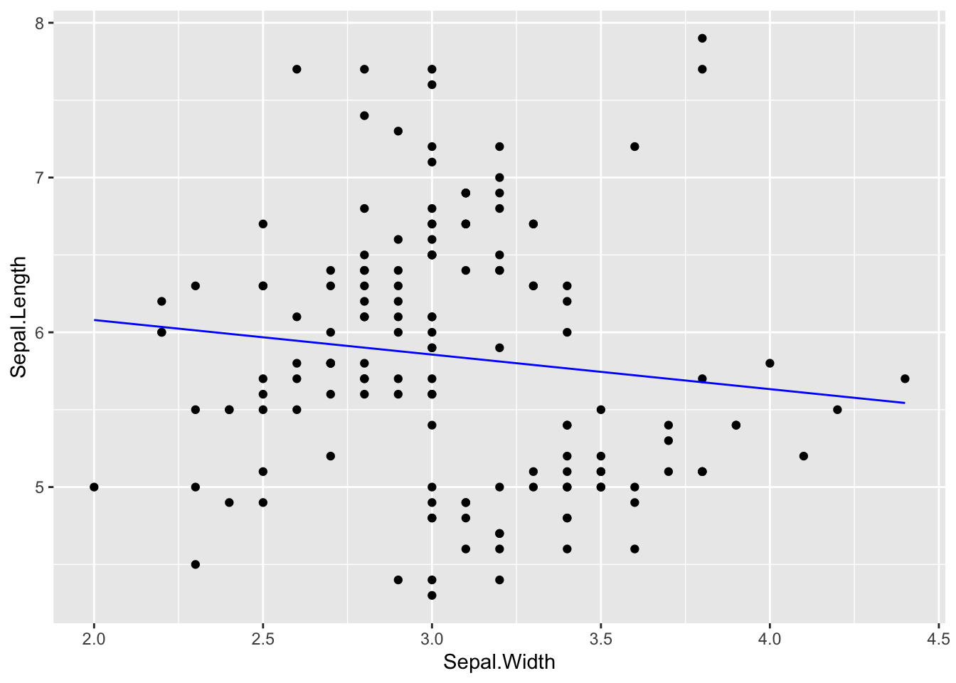
df3 %>% ggplot(aes(x = Sepal.Width, y = Sepal.Length)) + geom_point() + geom_smooth(formula = y~x, method = "lm", se = FALSE)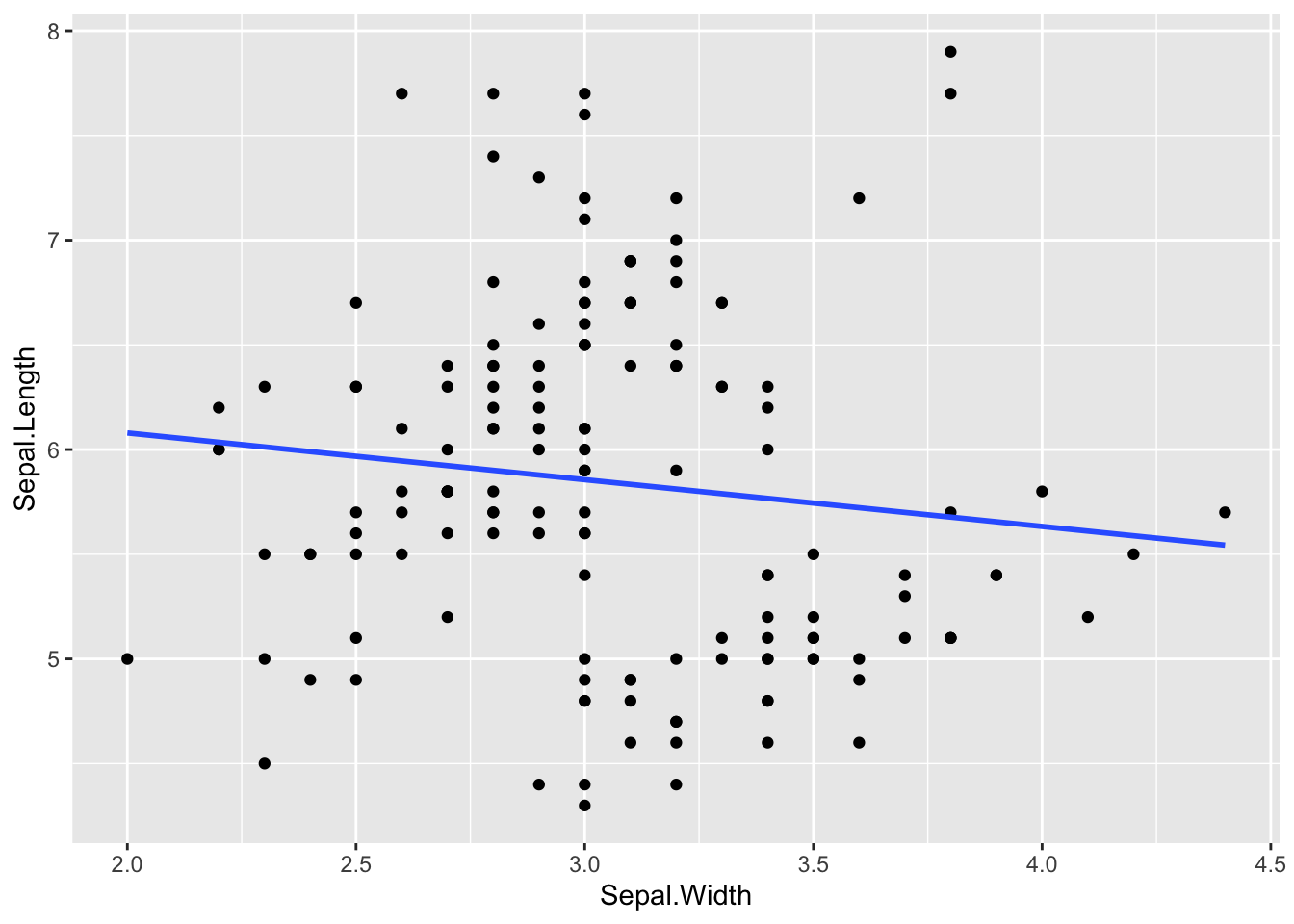
df3 %>% ggplot(aes(x = Sepal.Width, y = Sepal.Length)) + geom_point() + geom_smooth(formula = y~x, method = "lm")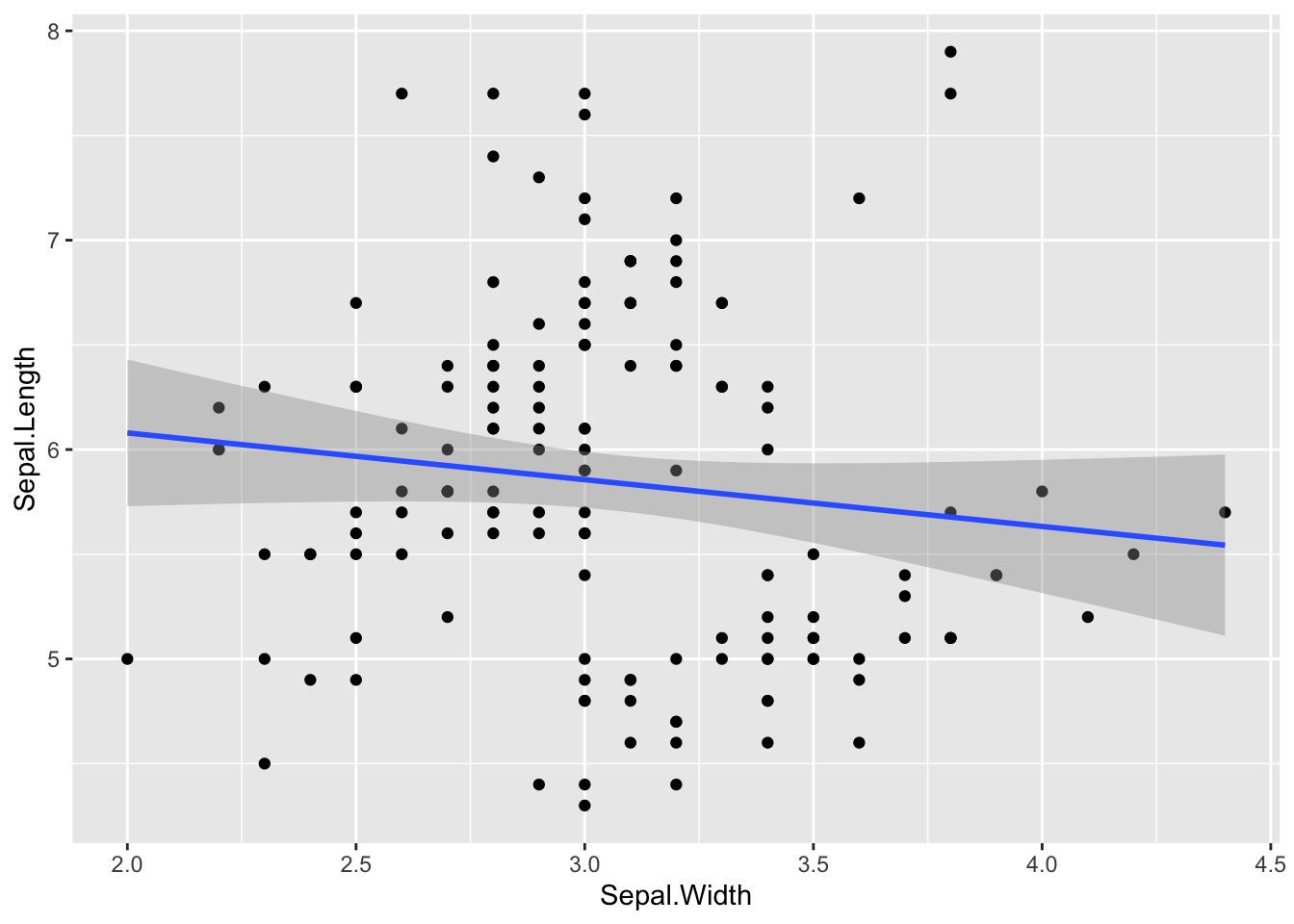
The shaded band is supposed to tell you the range of the prediction line should be under some assumption. I did not explain it because you need to be careful when interpreting its meaning.
15.5.4.3 References of broom
- Official site of R project: https://CRAN.R-project.org/package=broom
- Manual: https://cran.r-project.org/web/packages/broom/broom.pdf
- vignette: Introduction to broom
- vignette: broom and dplyr
- Augment data with information from a(n) lm object